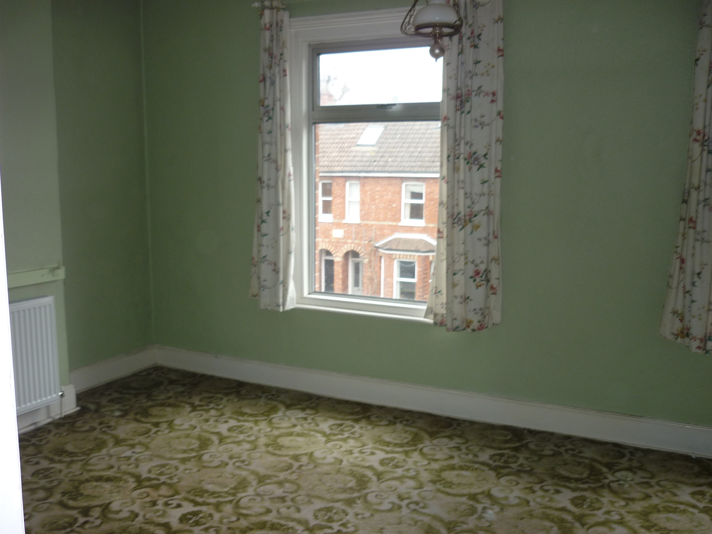
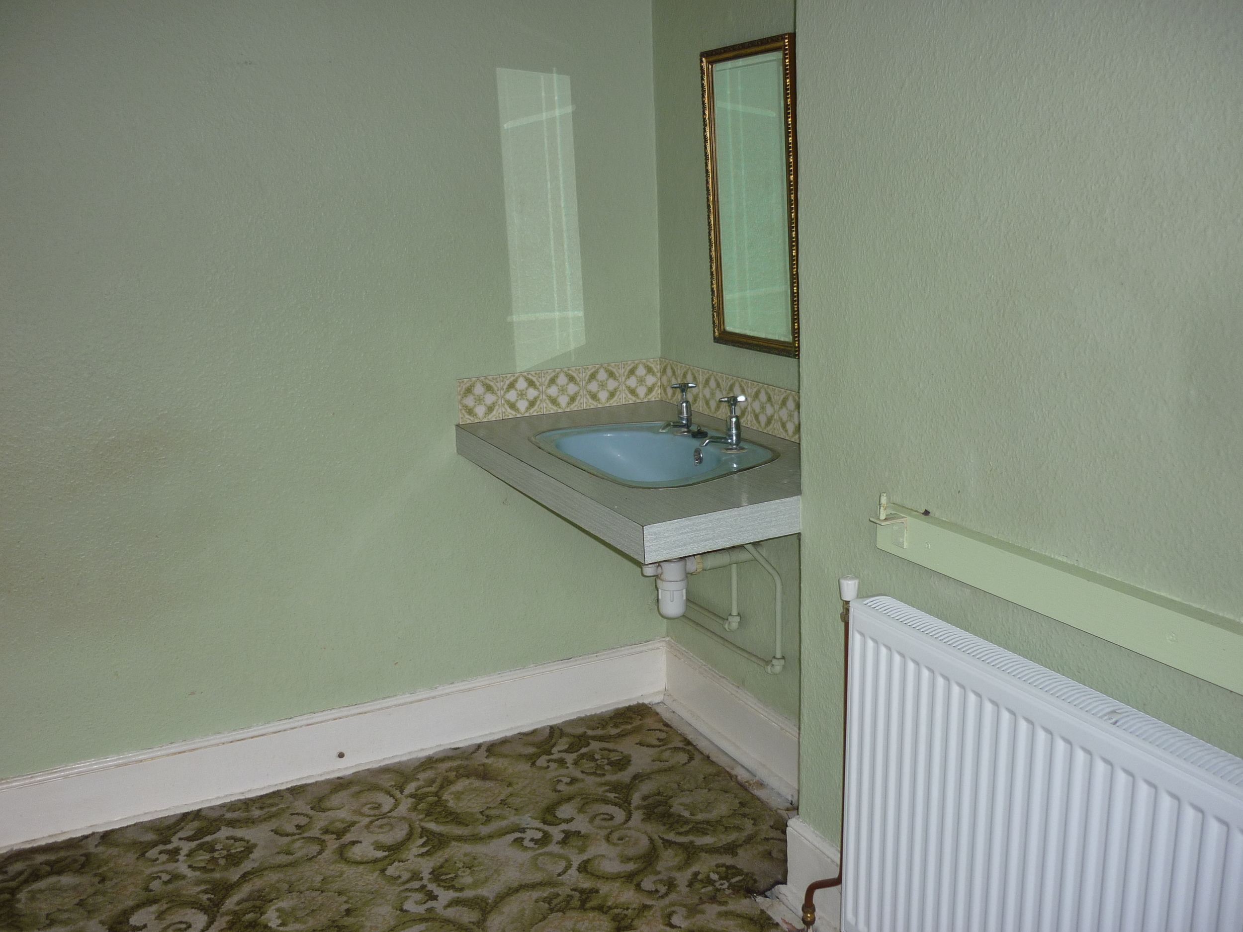
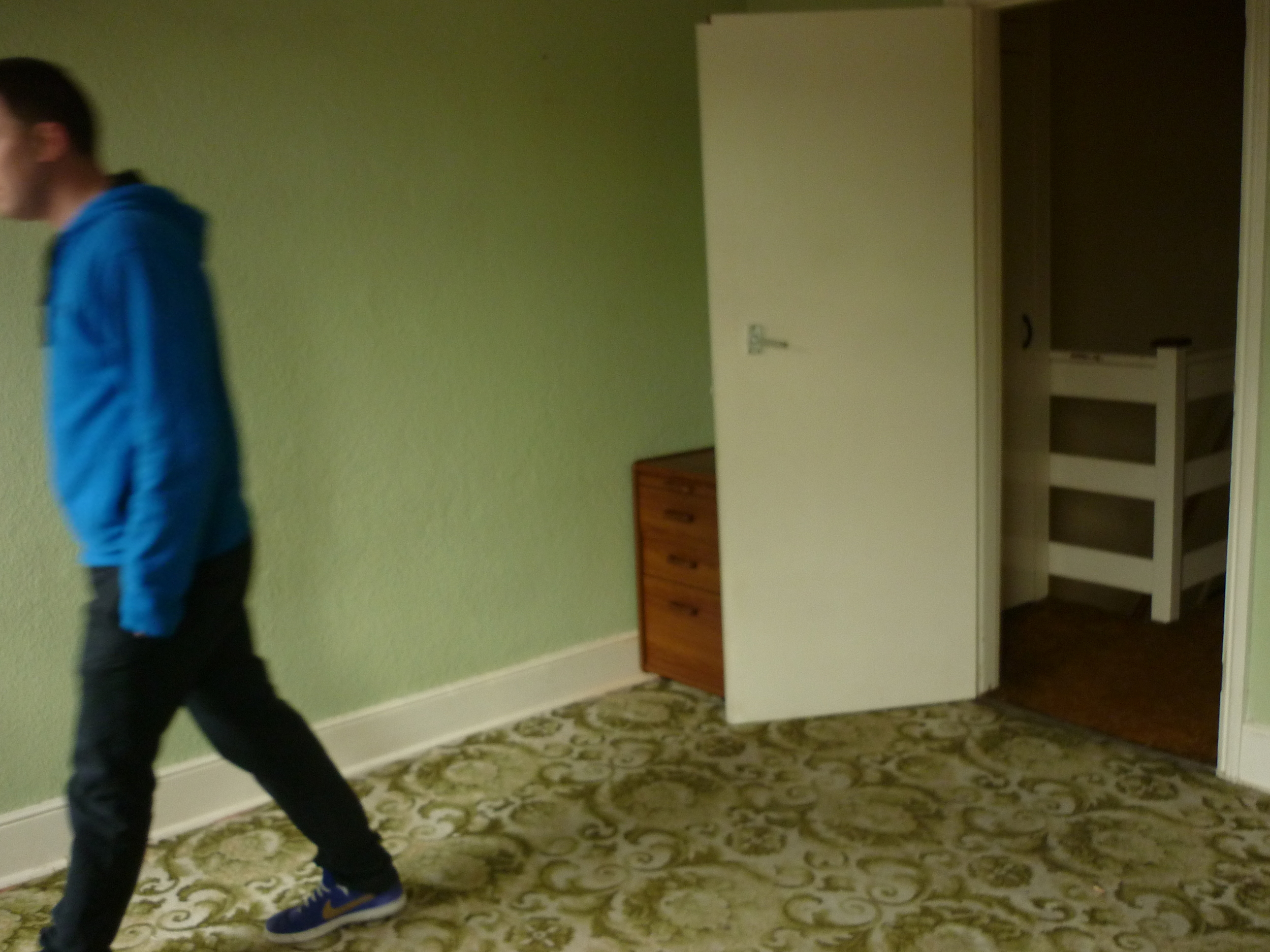
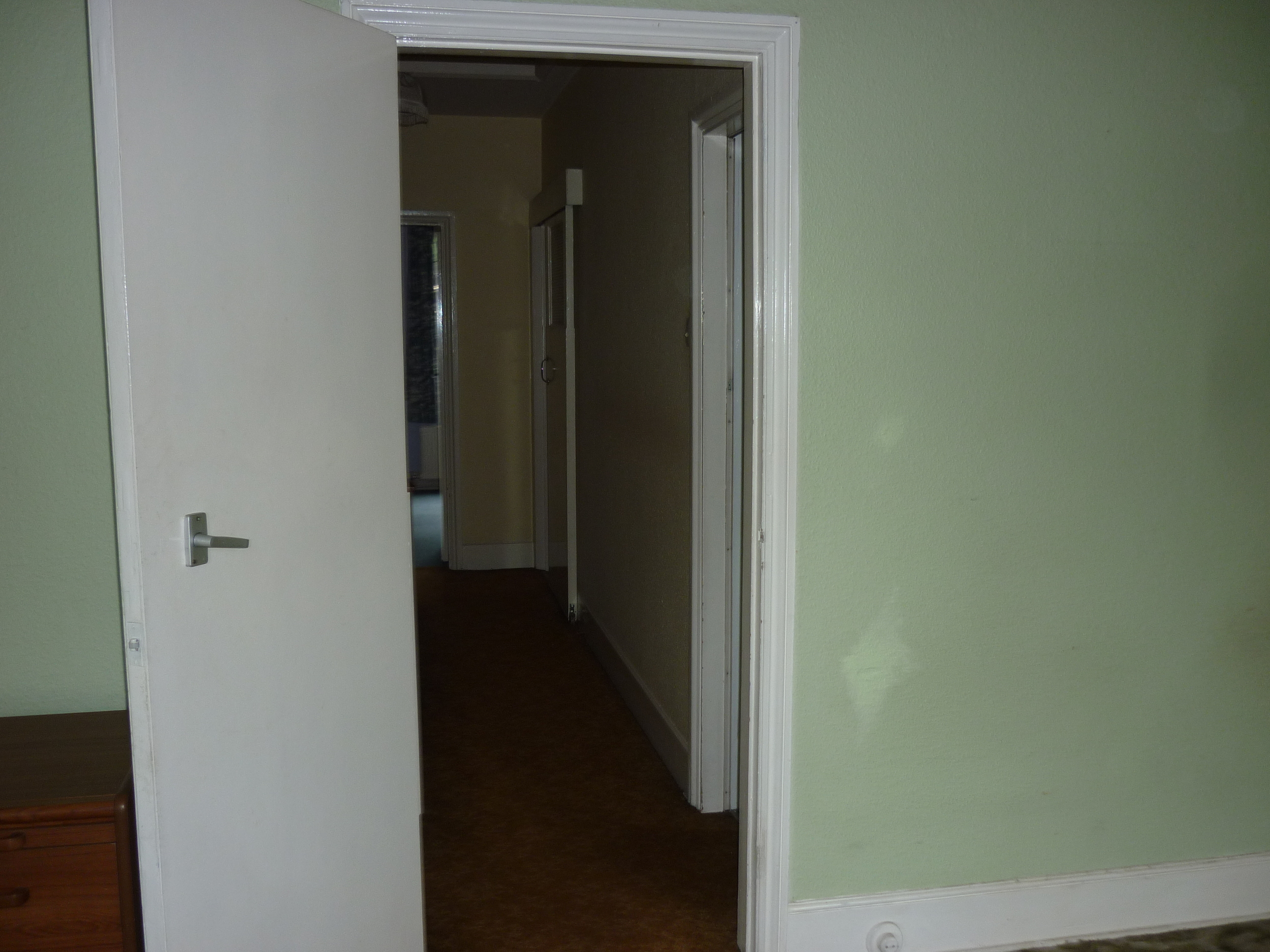
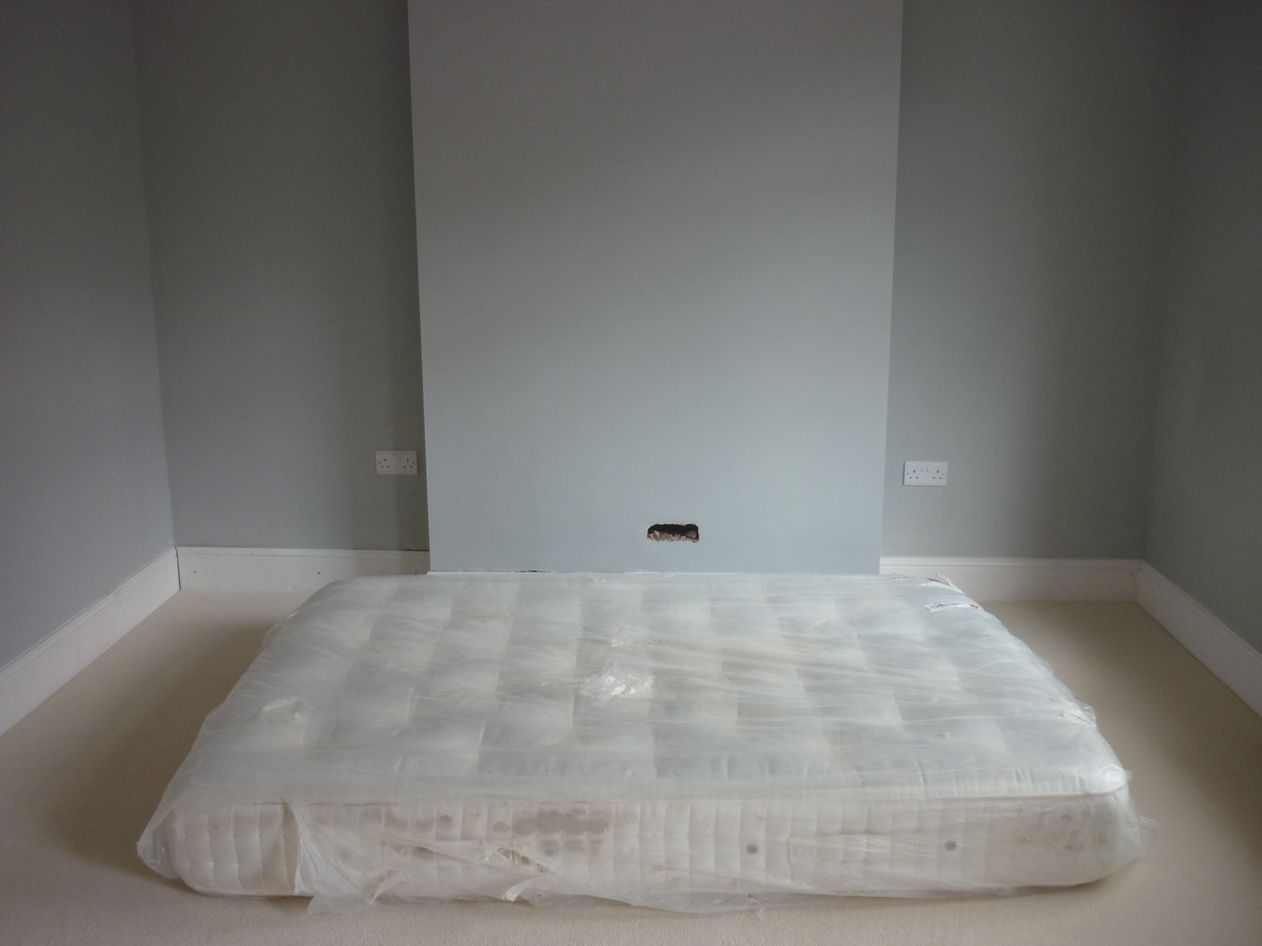
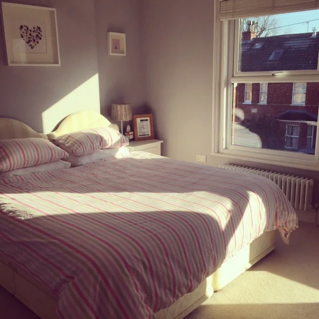
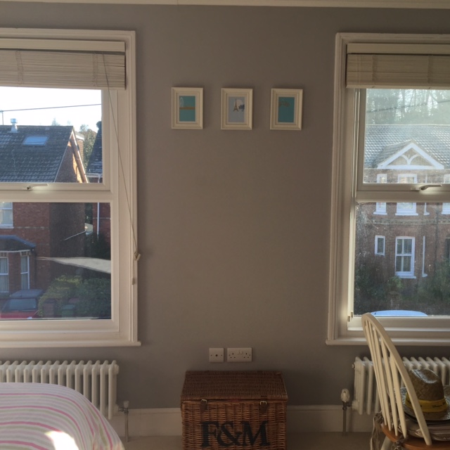
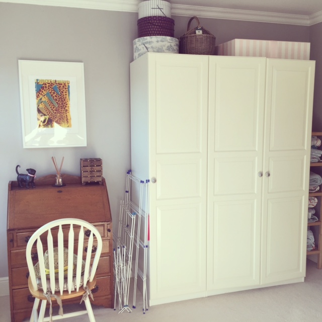
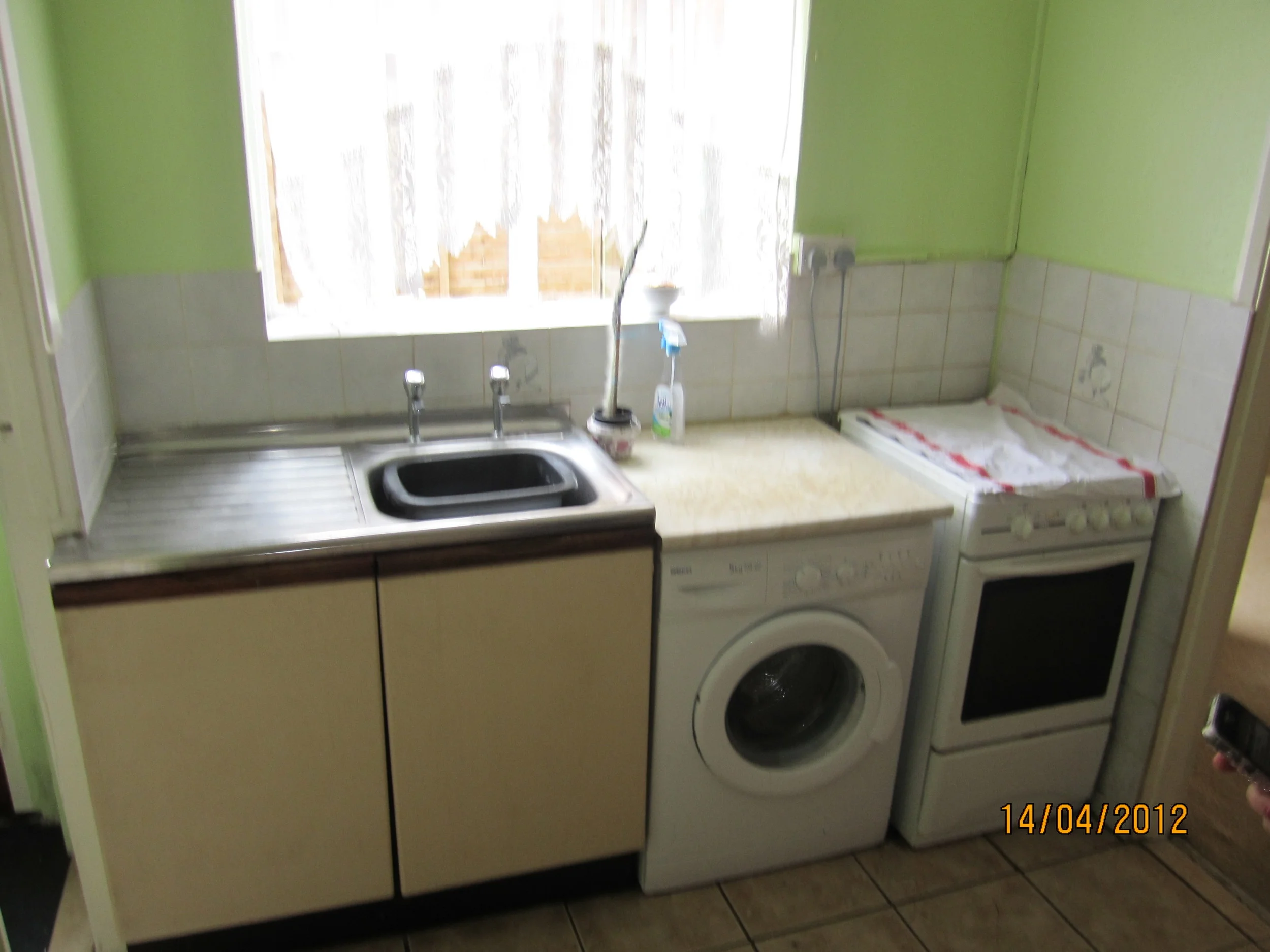
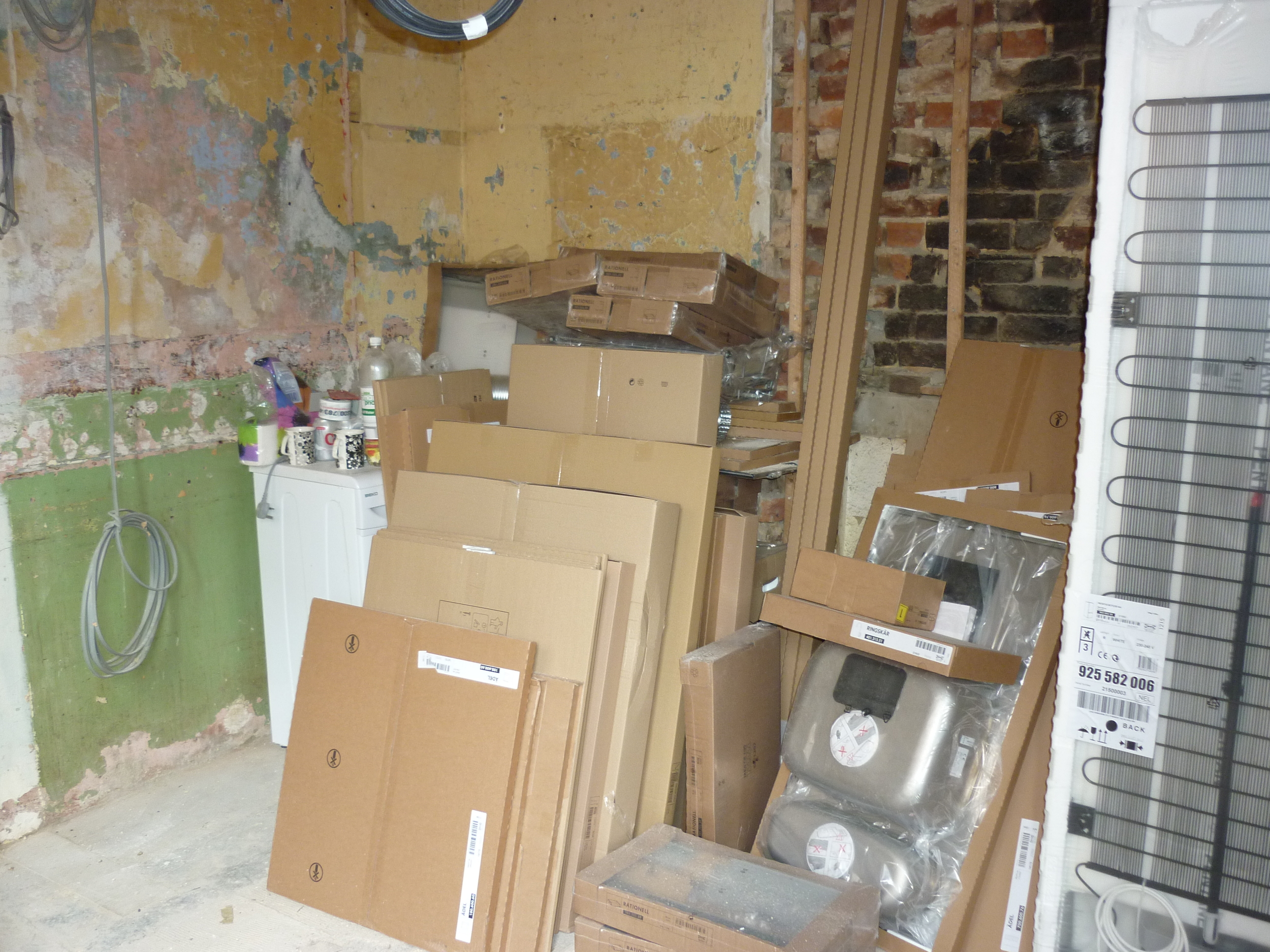
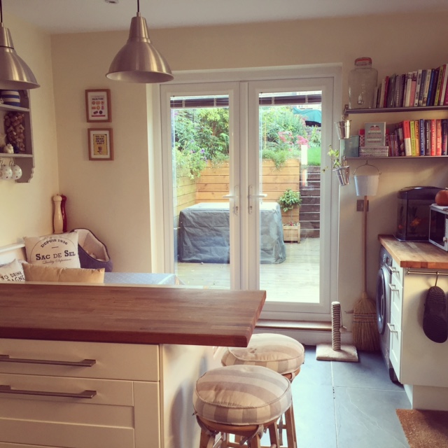
Creating our bathroom involved a lot of work. When we moved in, the bathroom was on the ground floor at the back of the house leading off from the kitchen, with a separate loo next to it. All very old school and definitely not practical for us. We love to entertain and spend time in the garden - this layout meant there was only a small side door leading to the garden and the kitchen area was pretty pokey.
THE PLAN
- We knew we'd want to convert the loft in the future, so we sacrificed a first floor bedroom to turn it into our main bathroom.
- The existing bathroom and separate loo downstairs were knocked down to create an open plan kitchen diner, with french doors being installed in the back wall to allow better access to the garden.
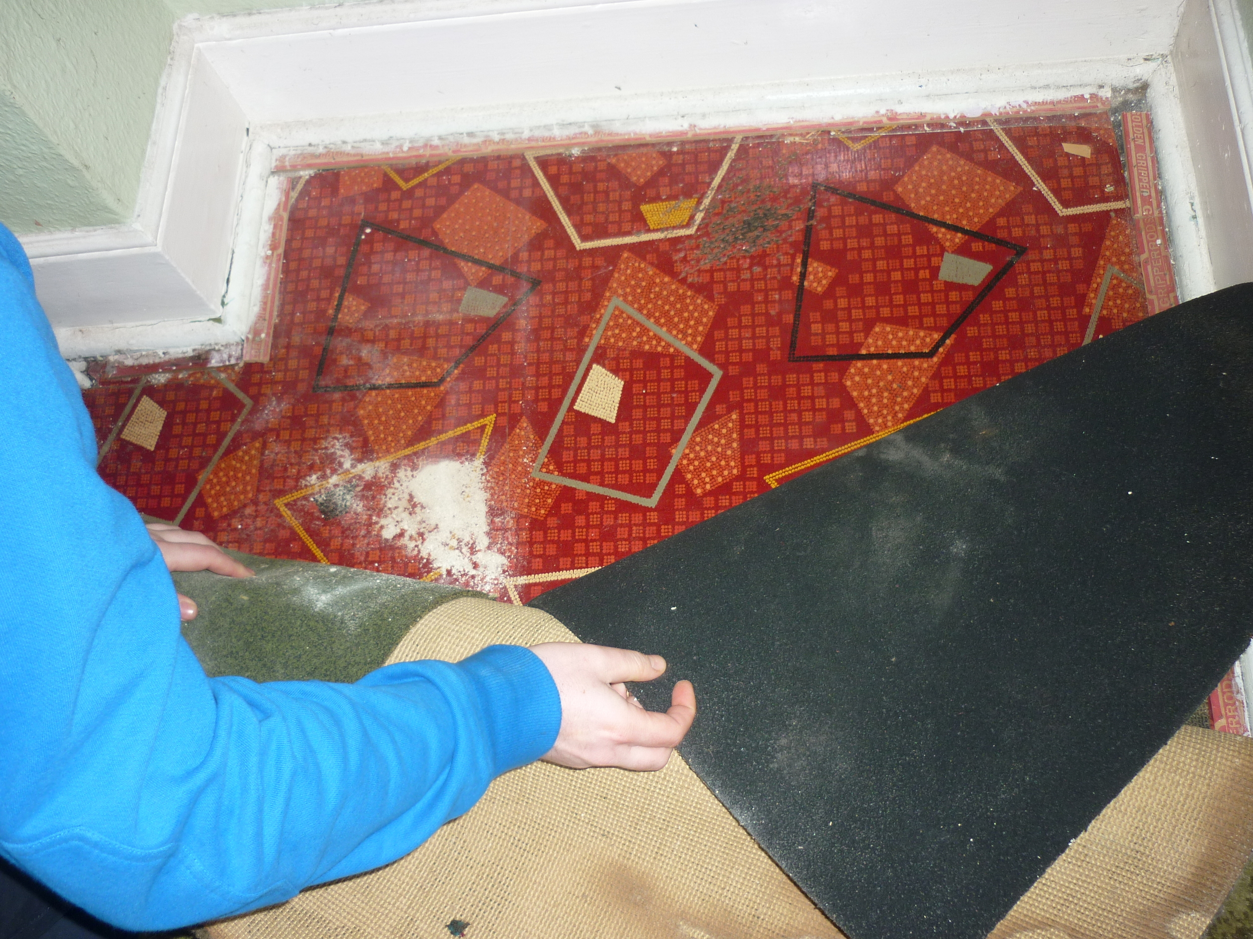
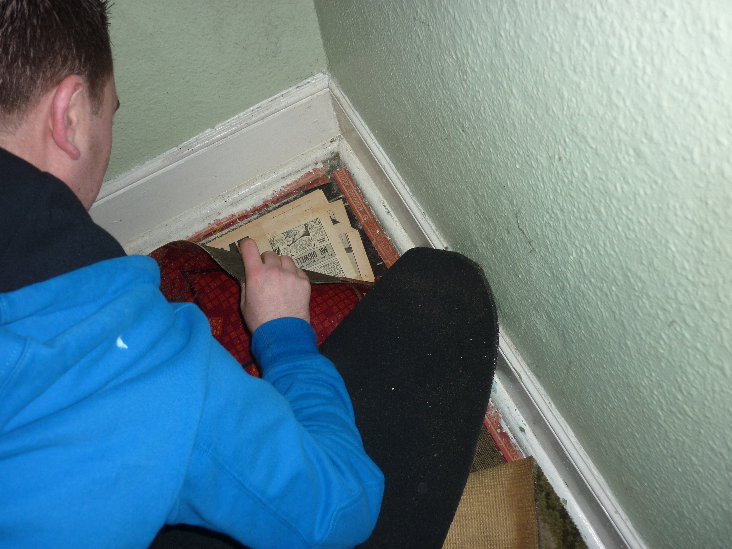
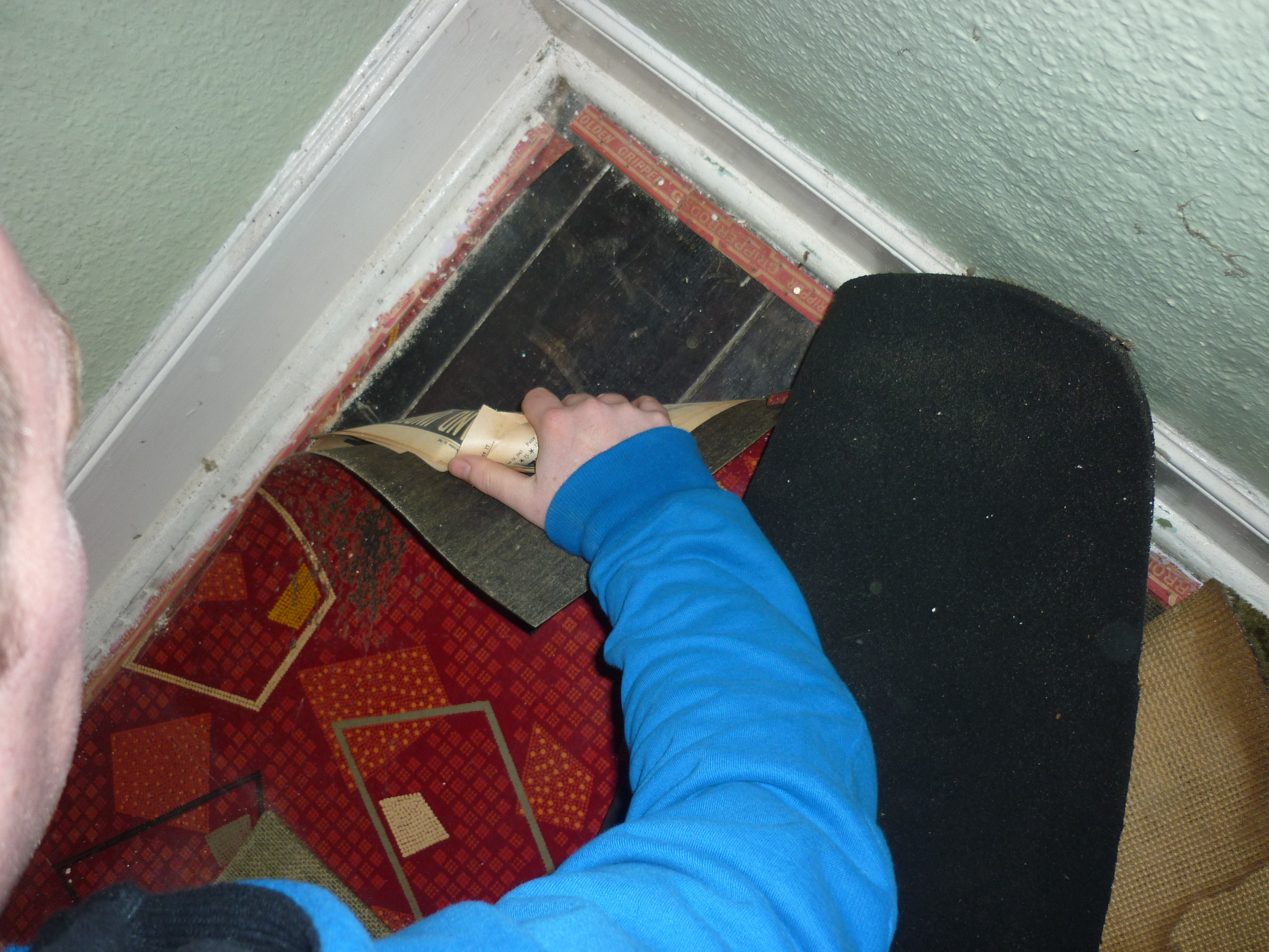
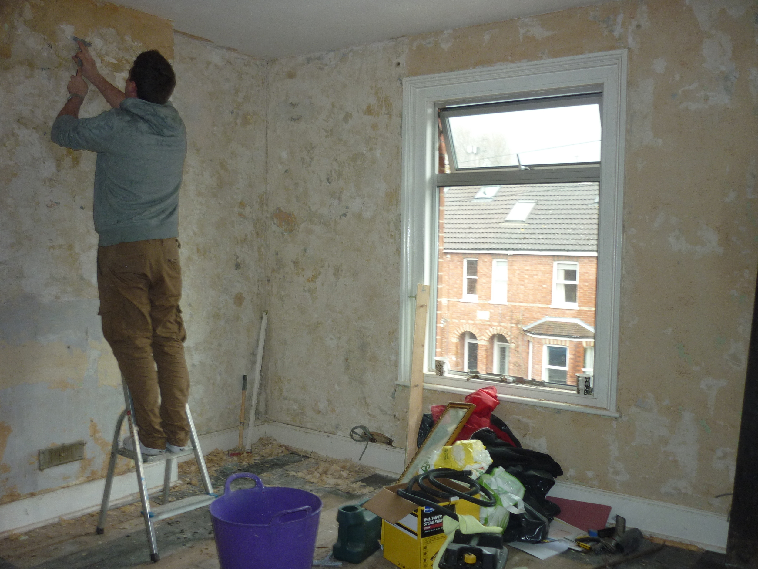
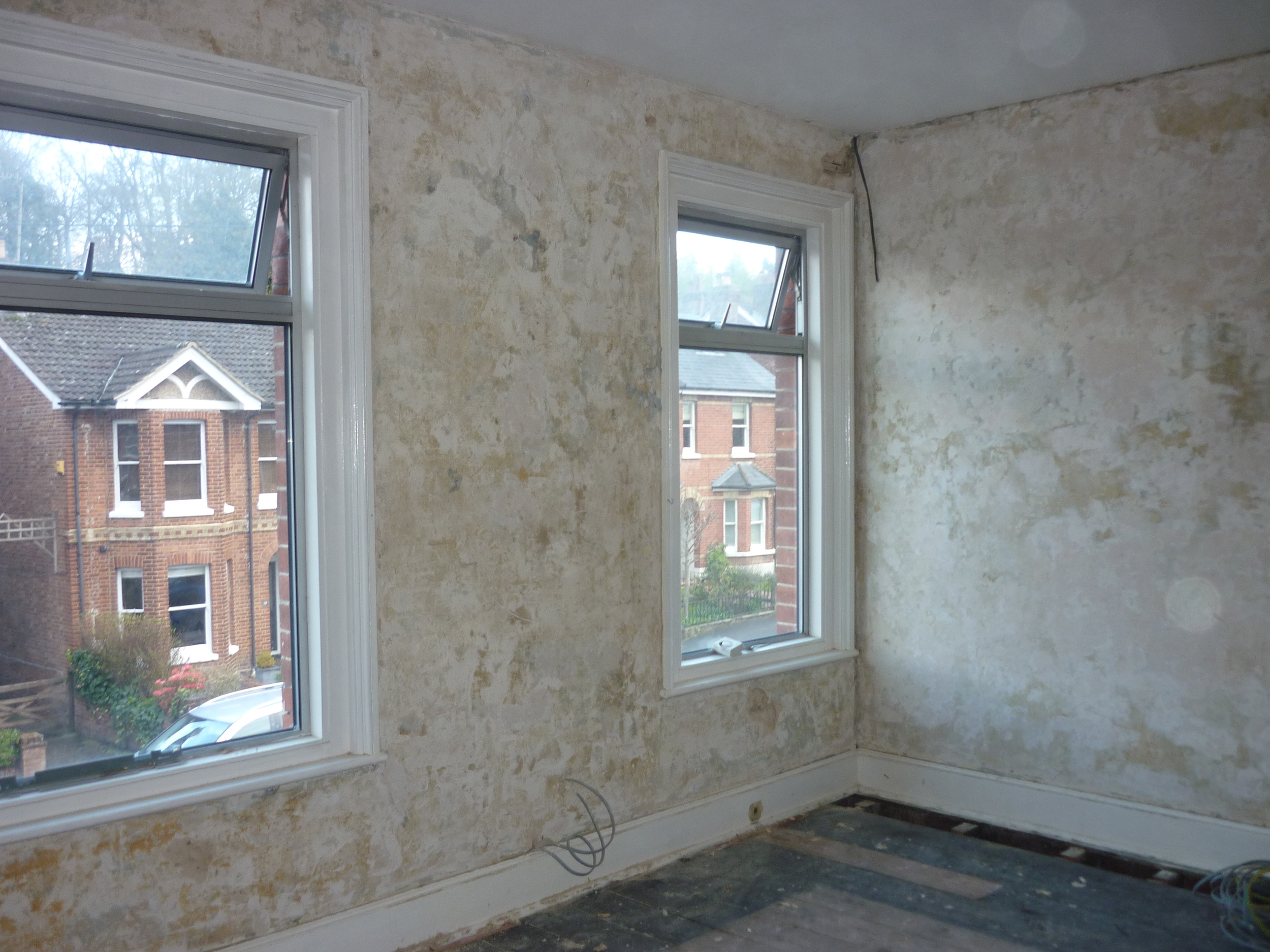
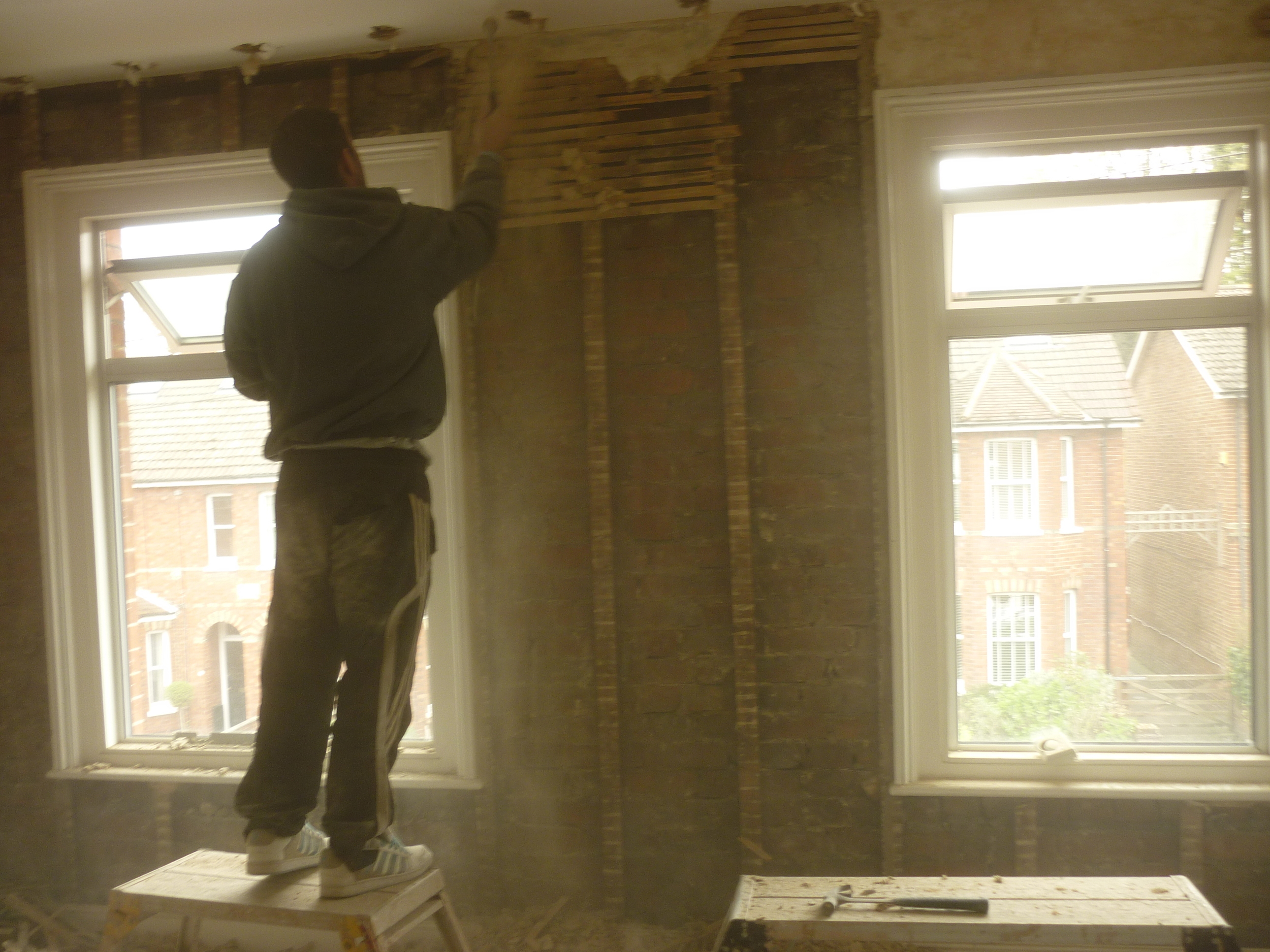
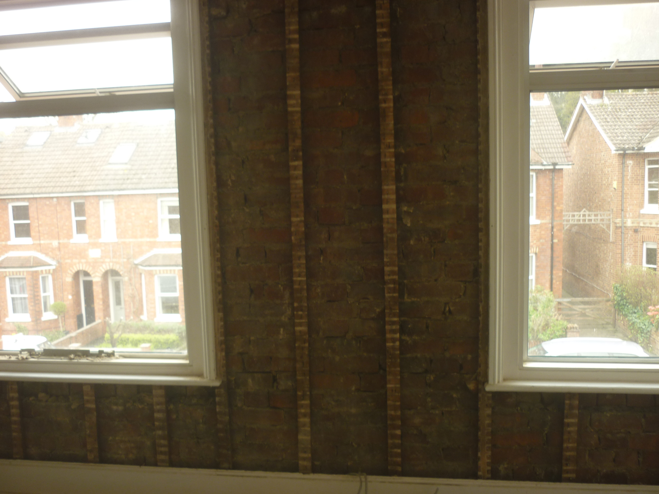
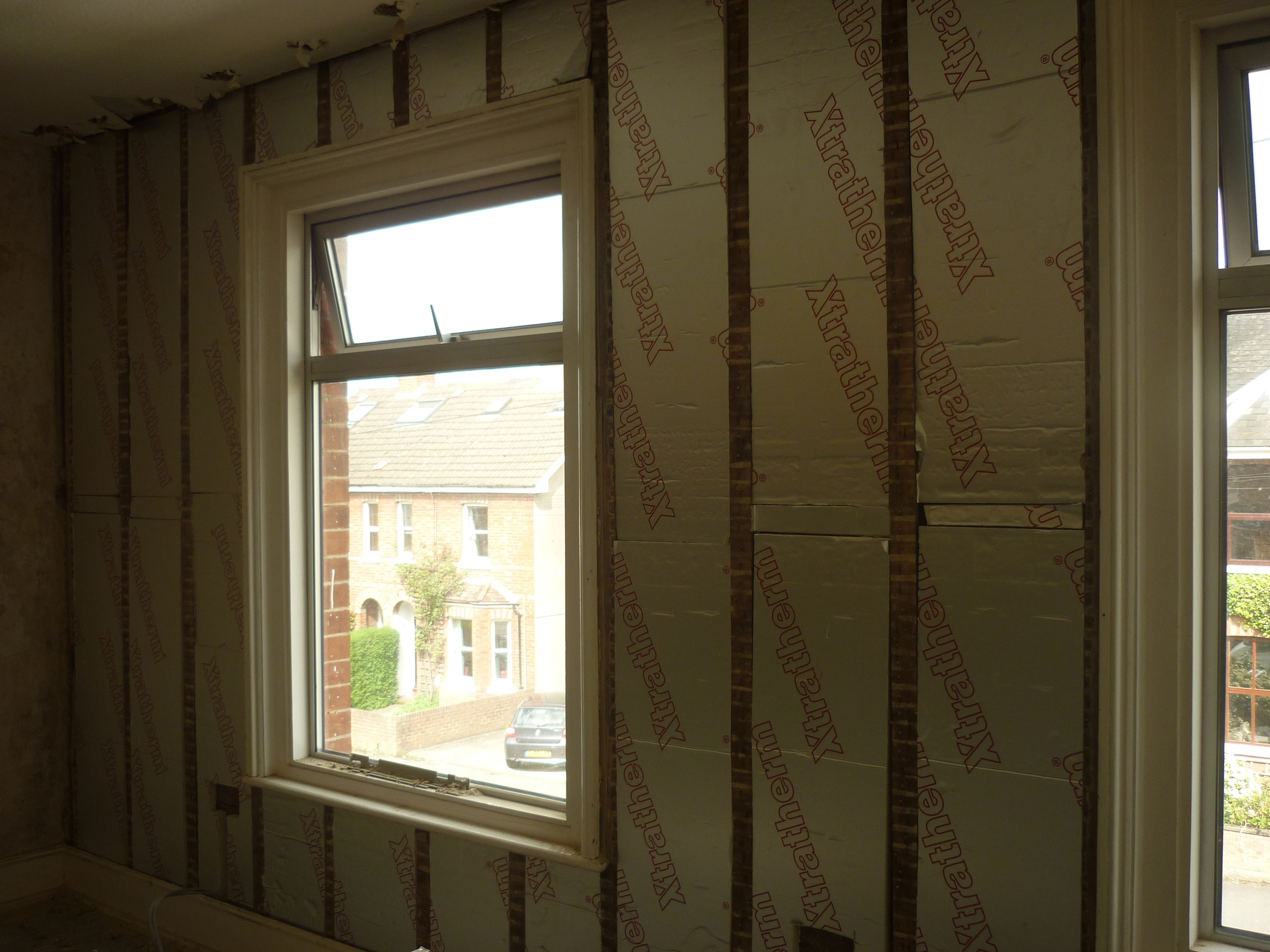
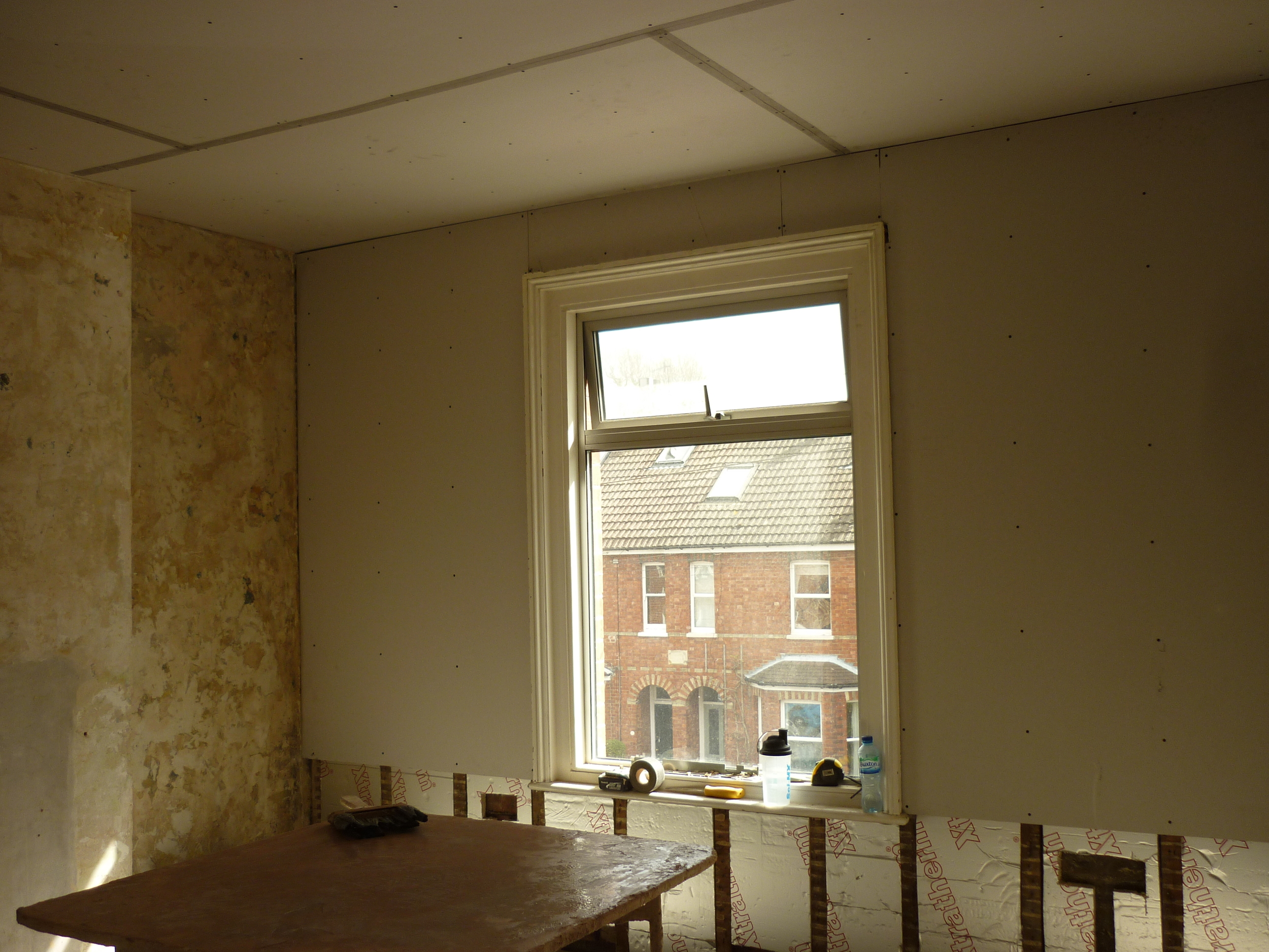
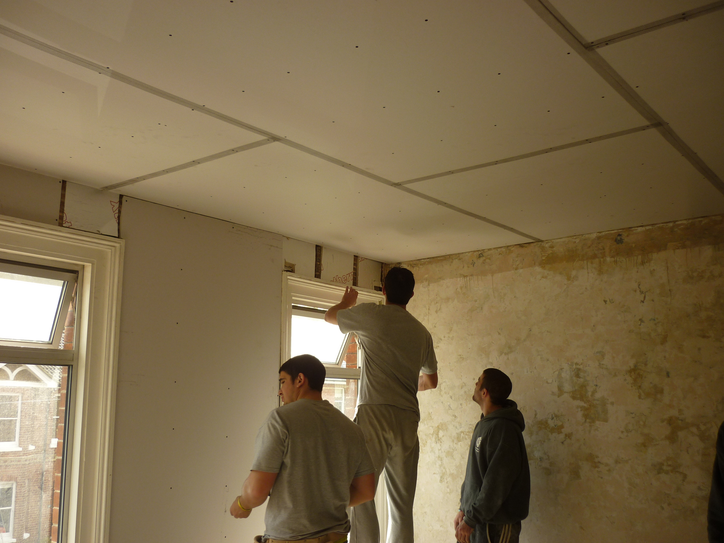
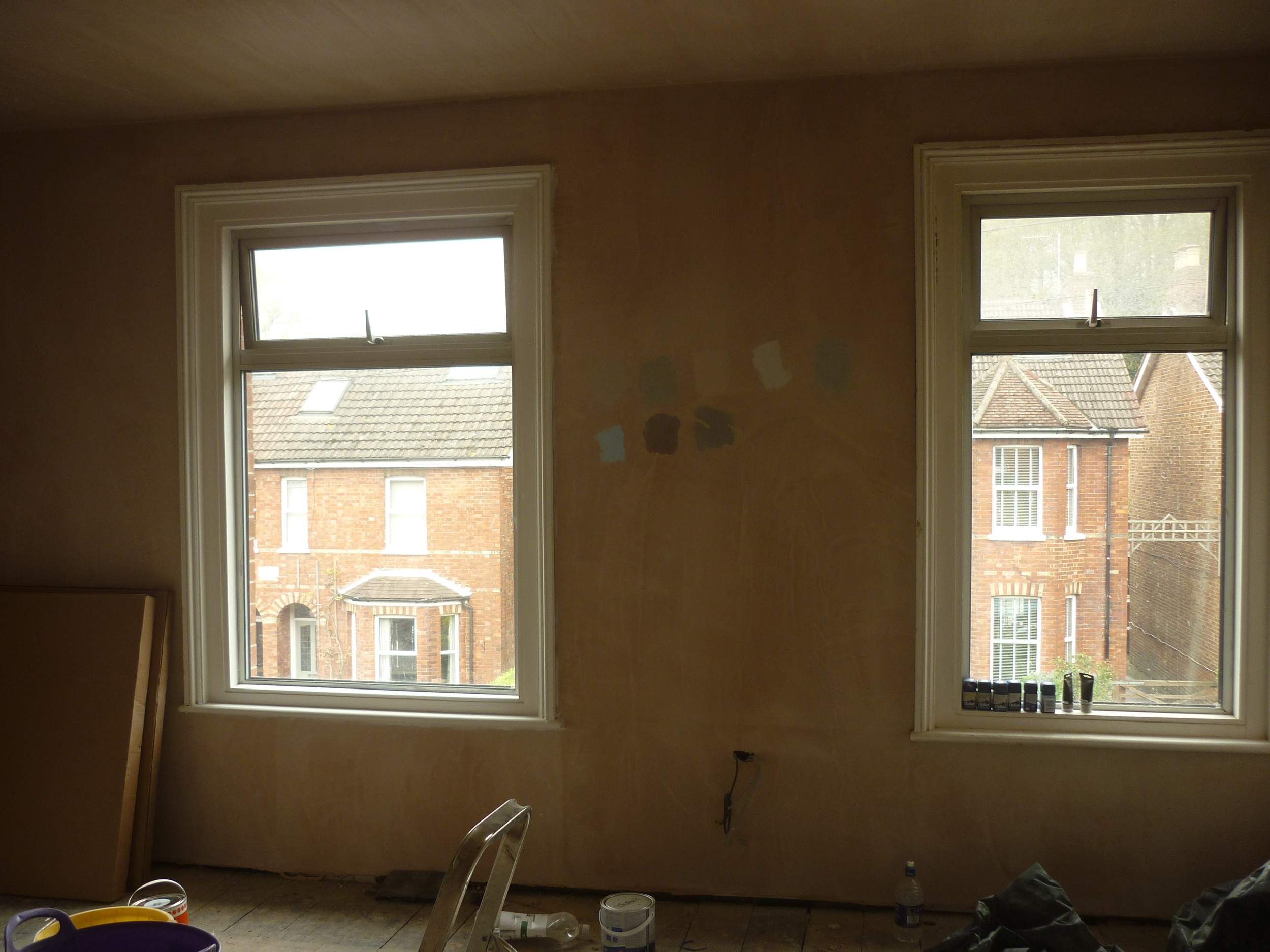
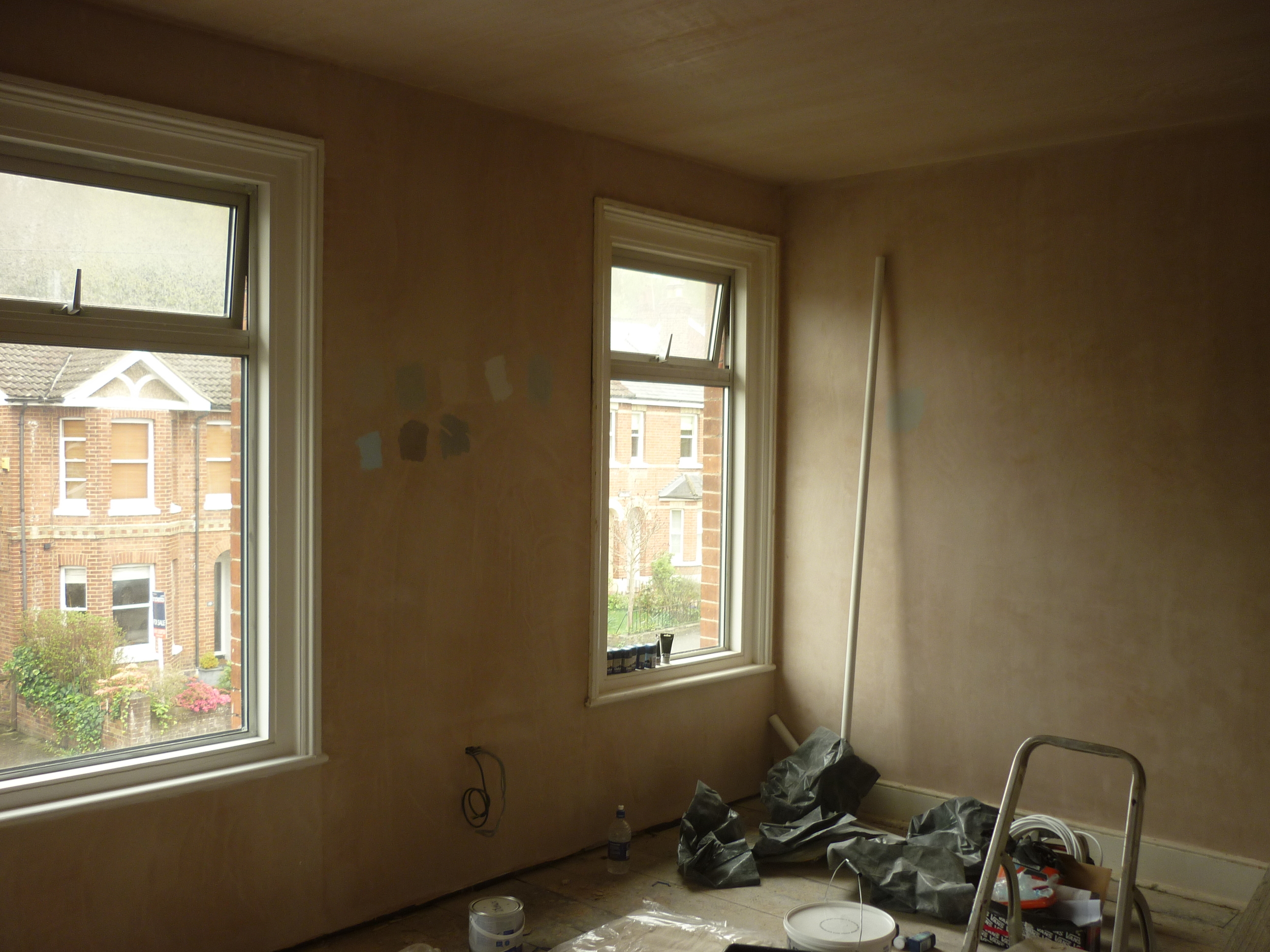
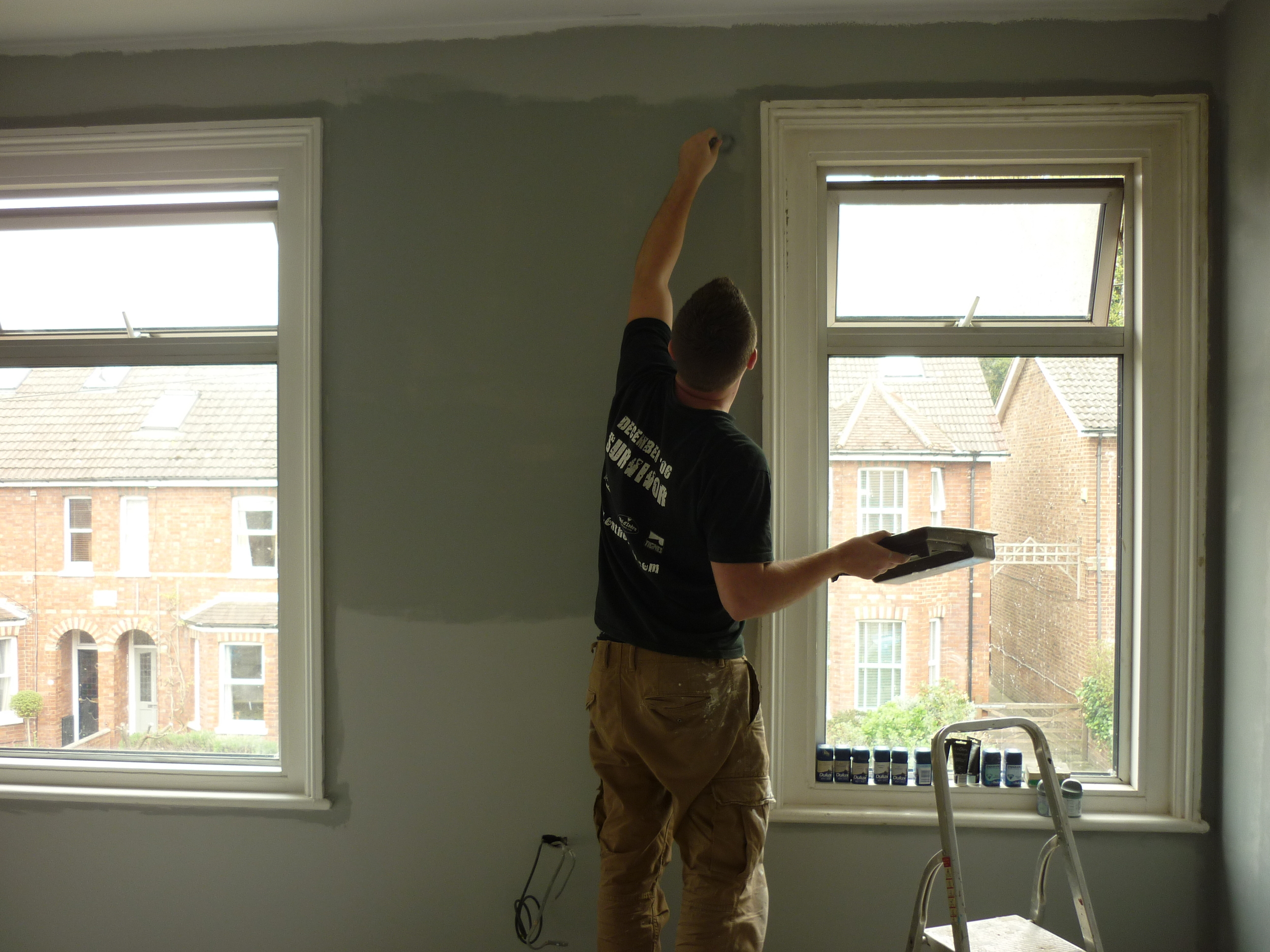
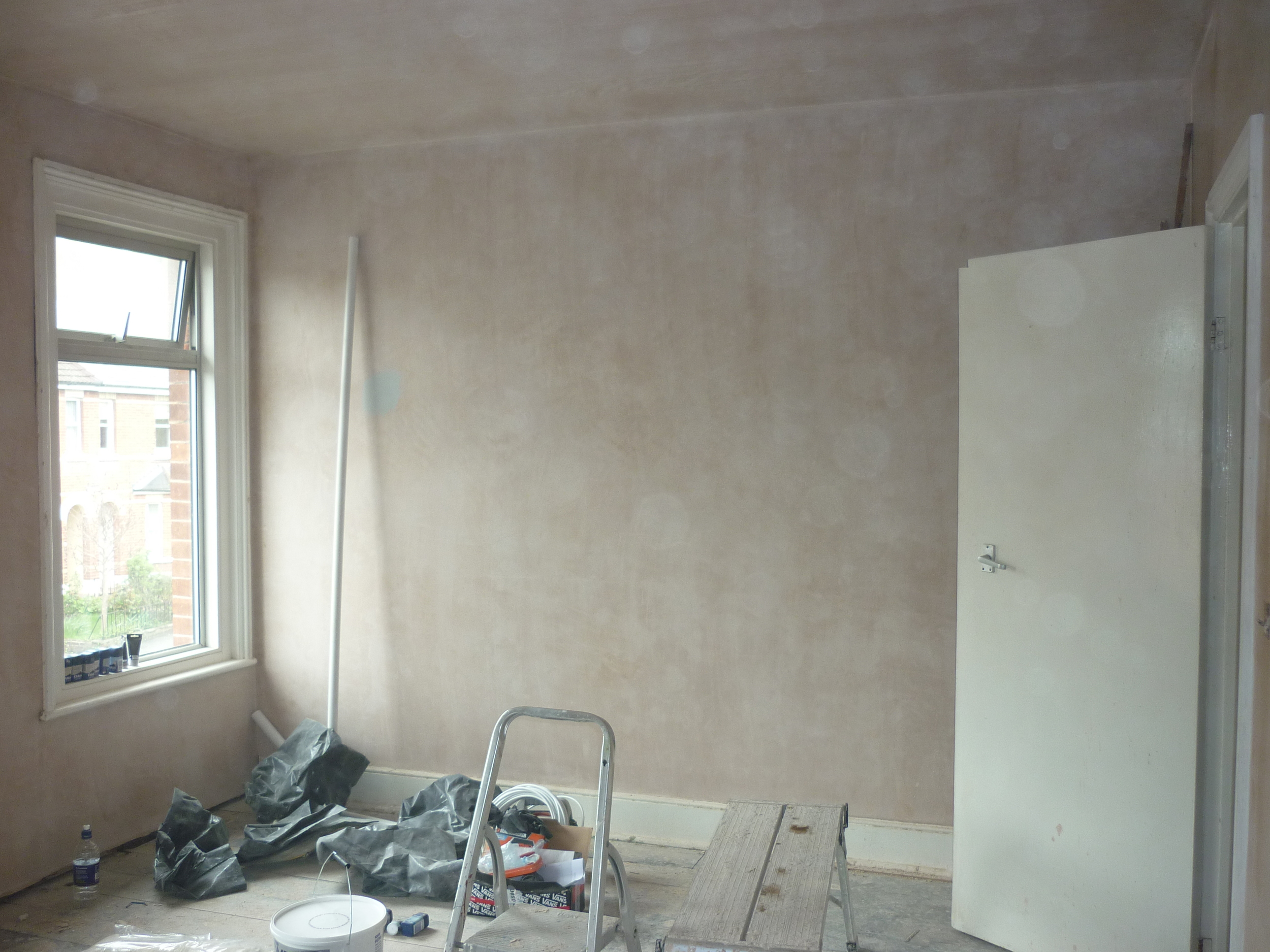
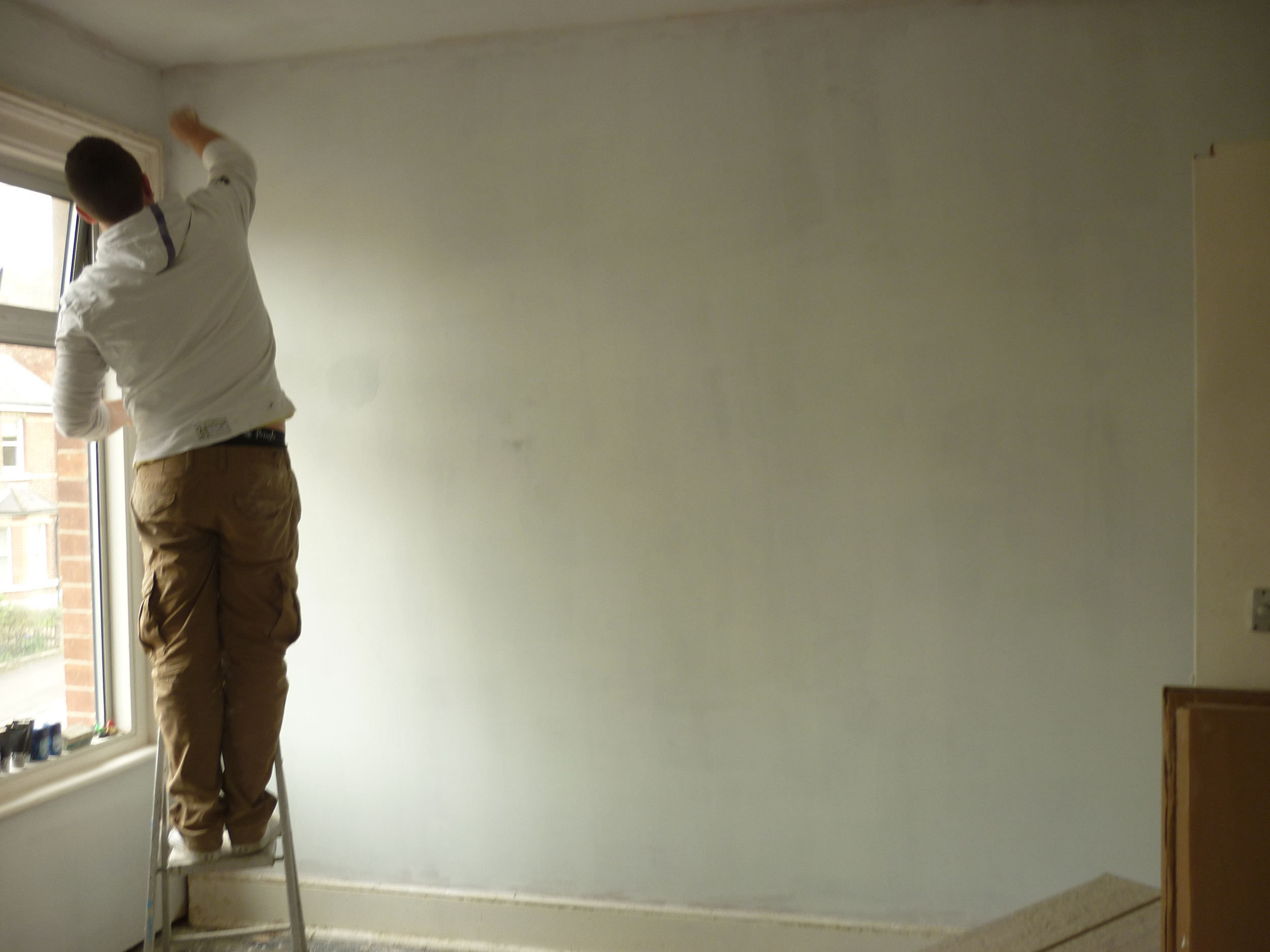
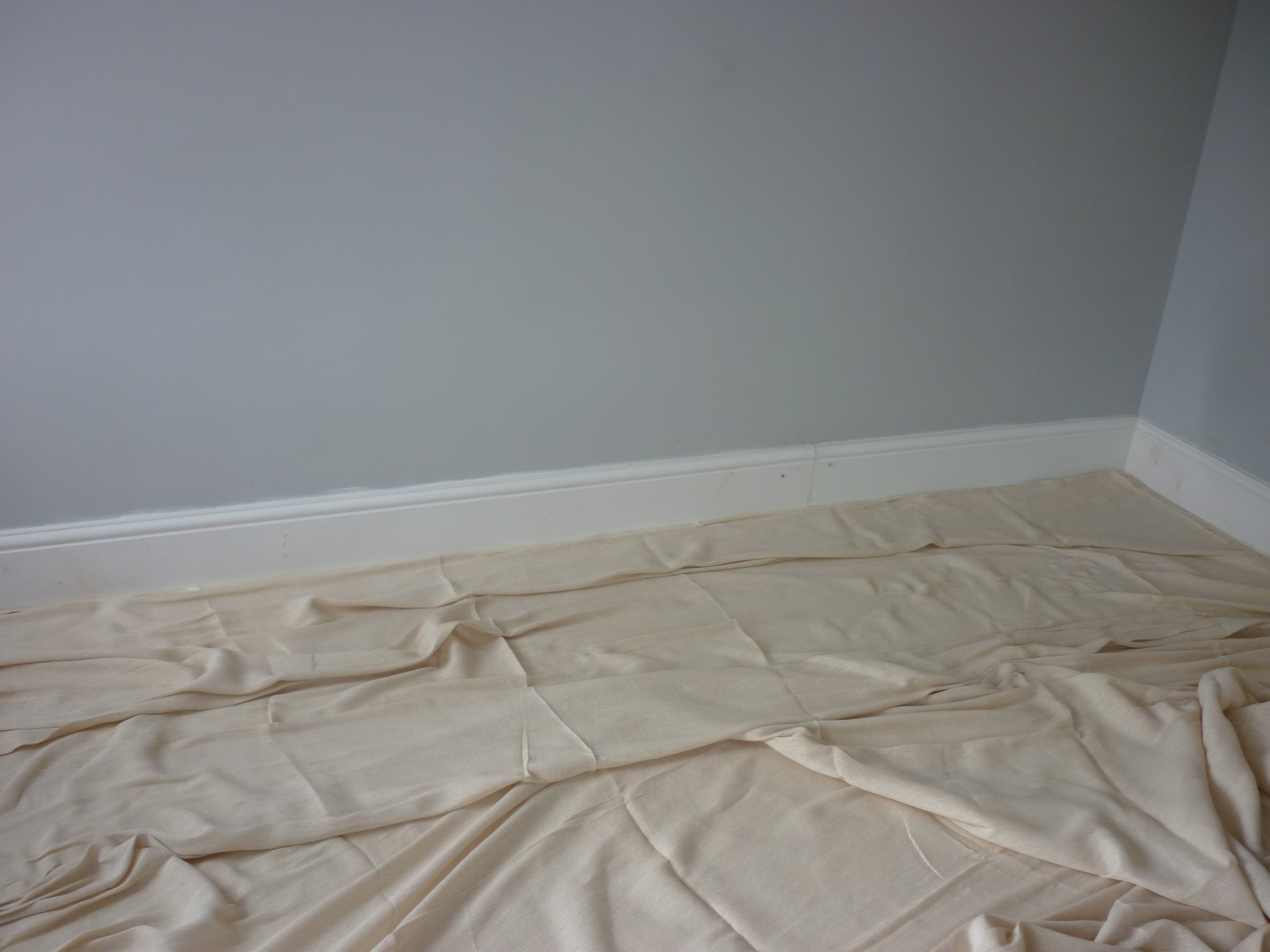
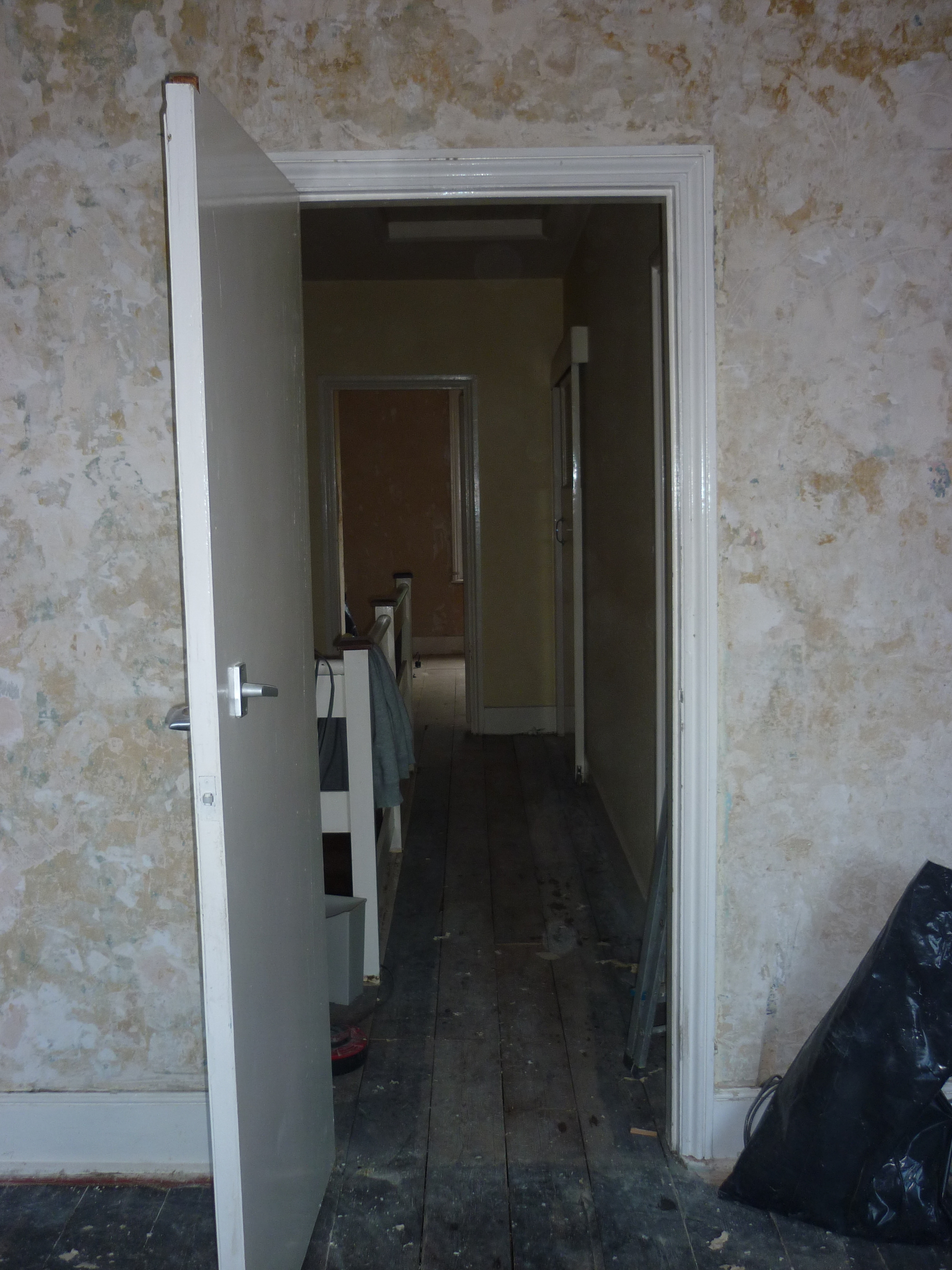
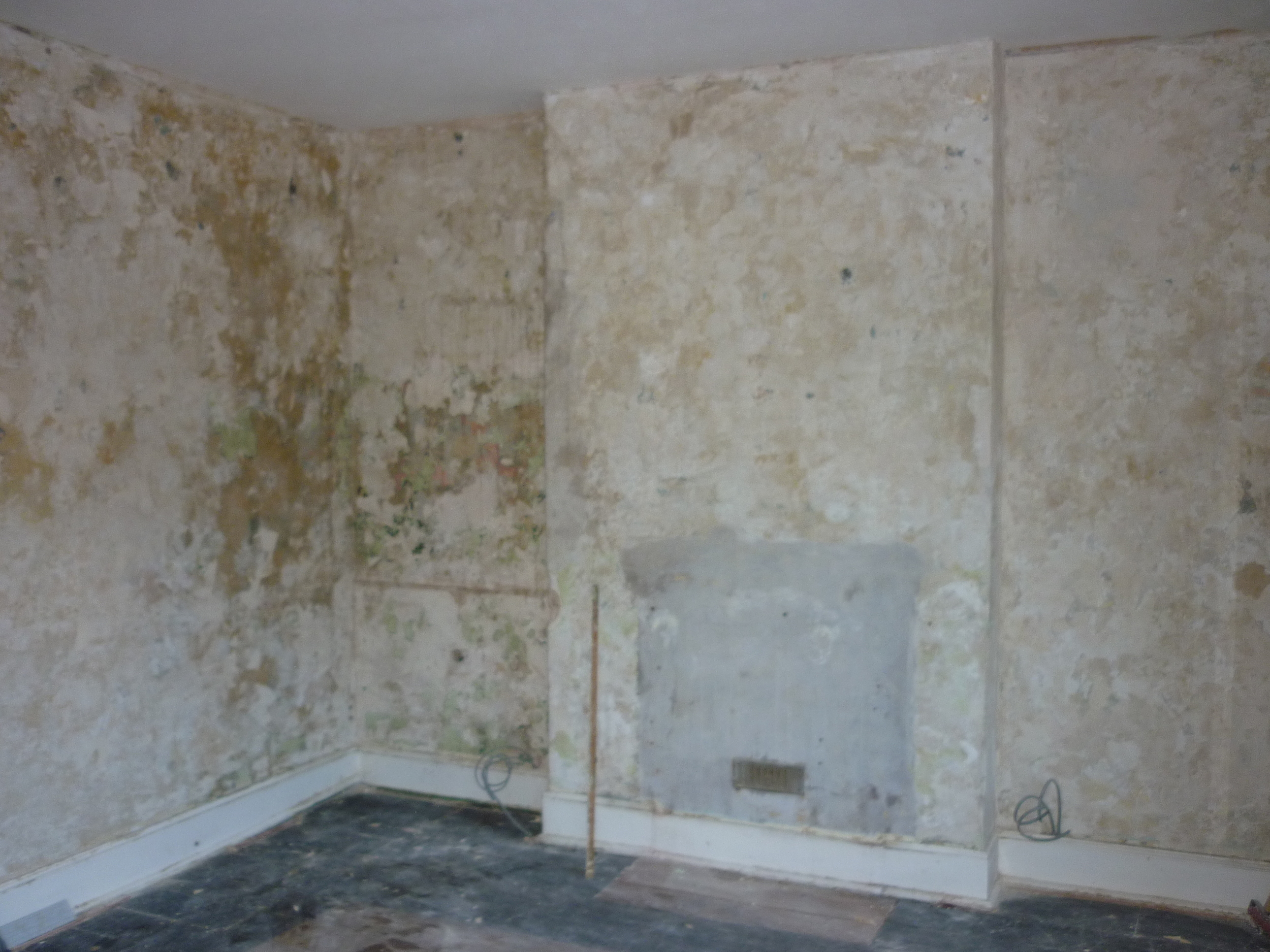
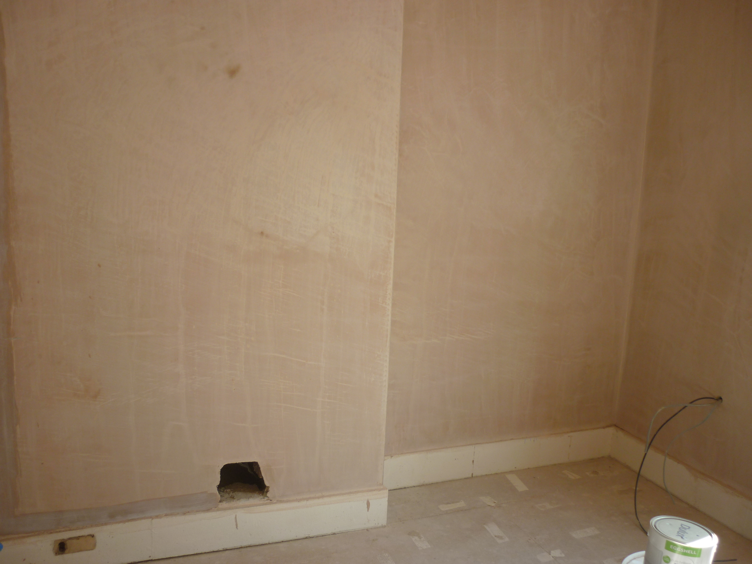
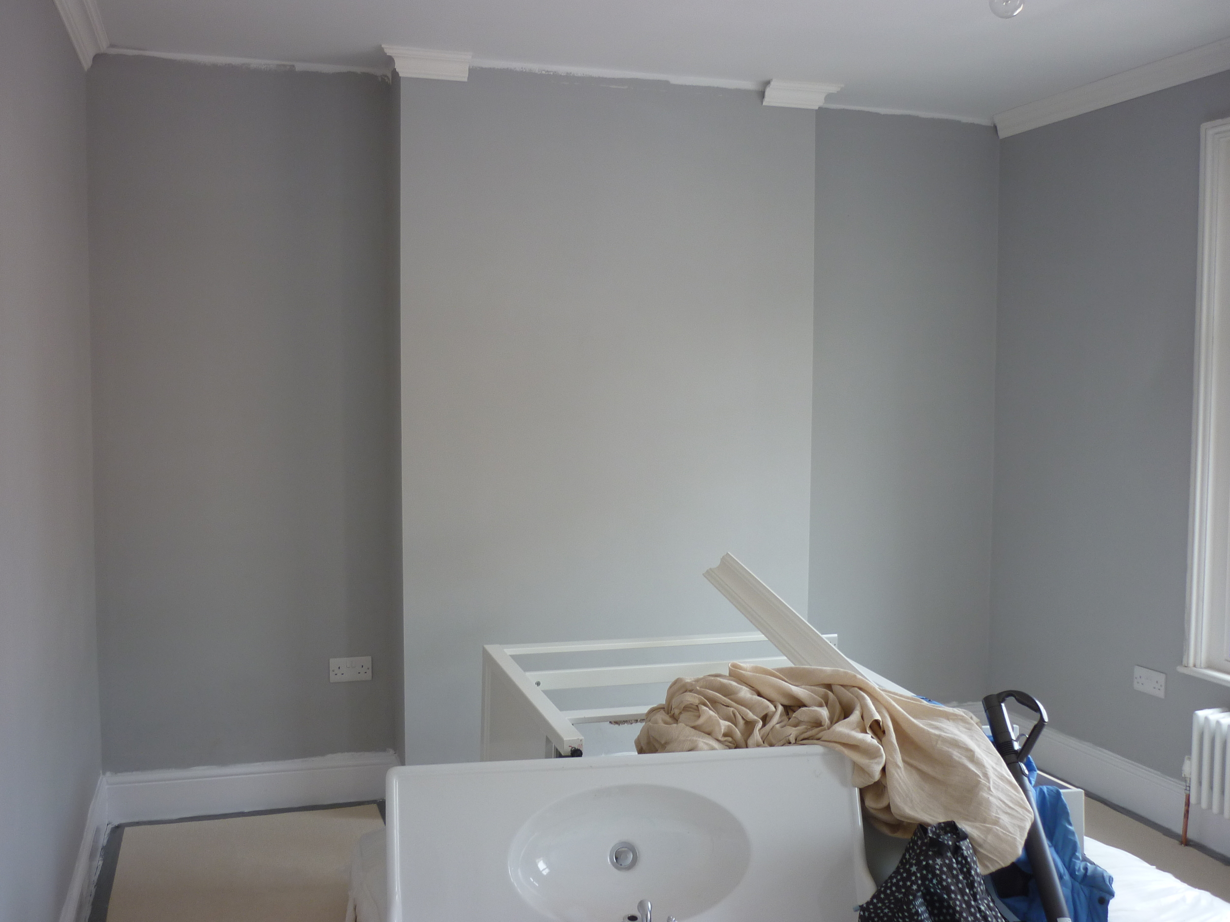
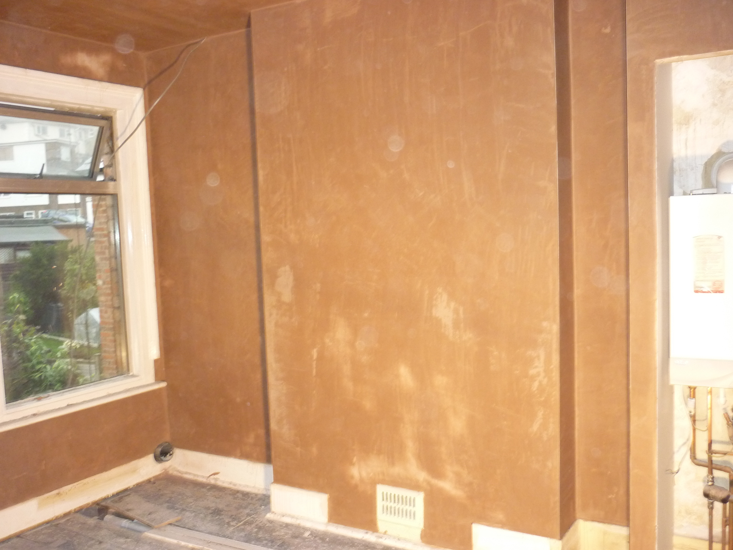
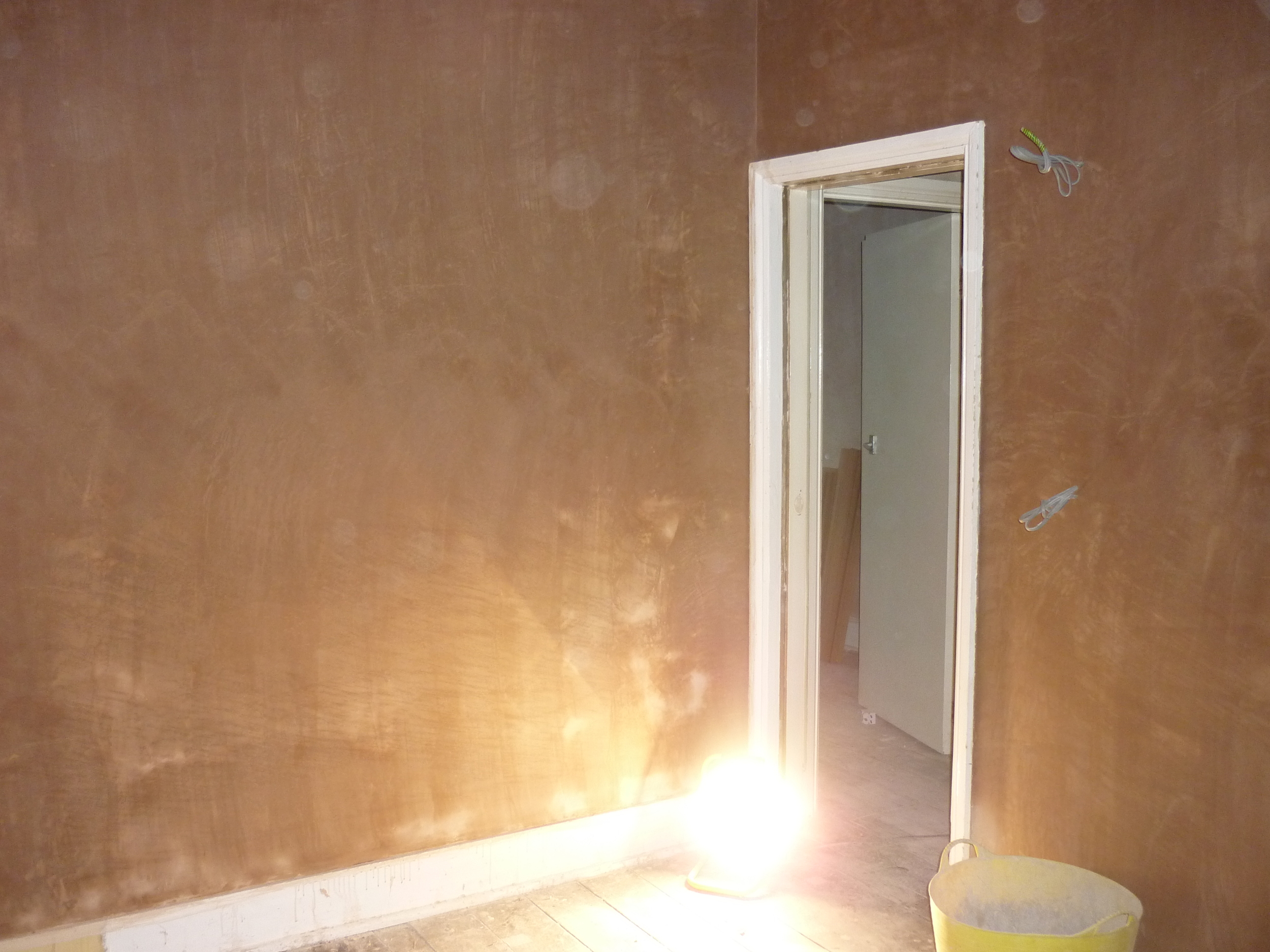
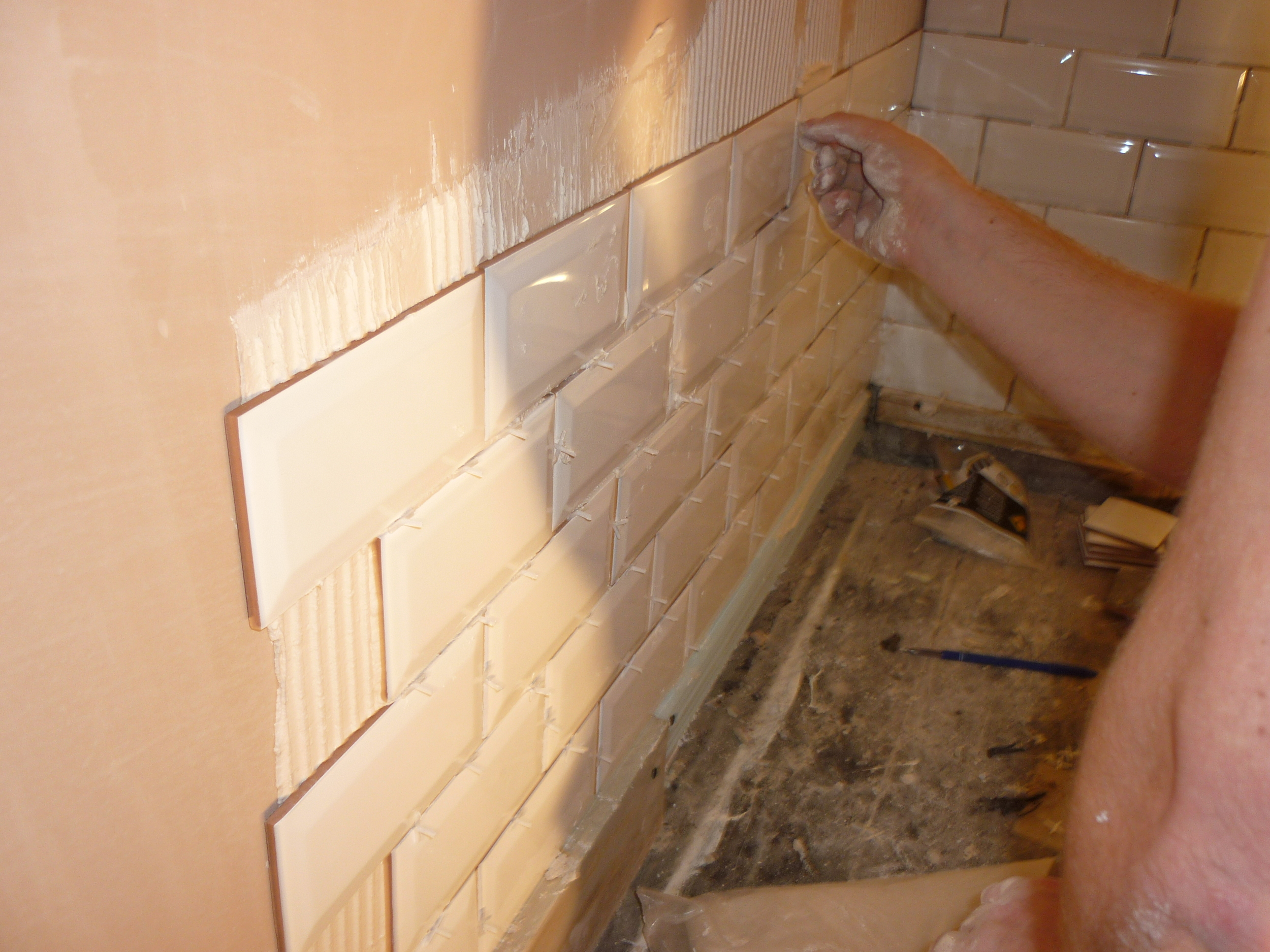
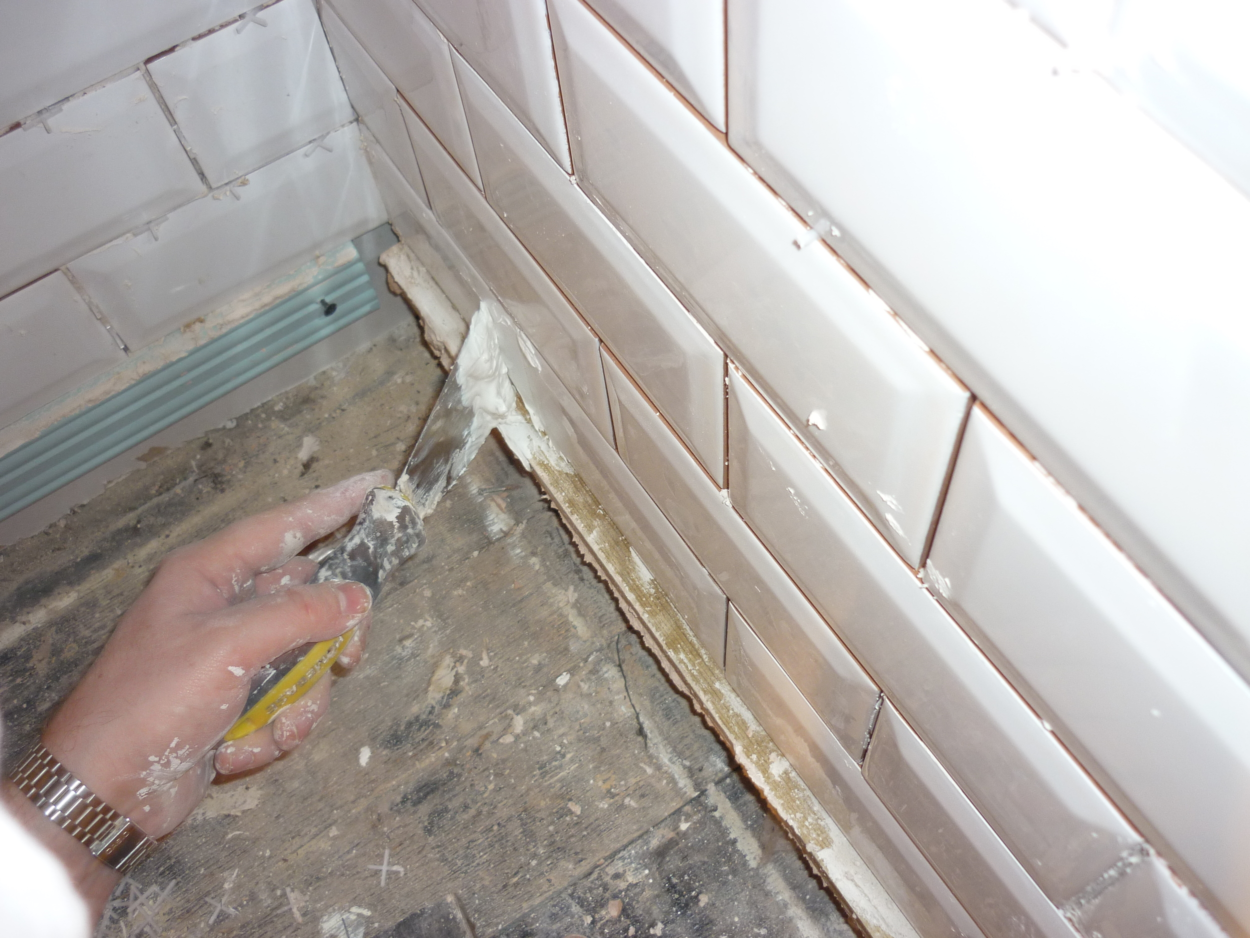
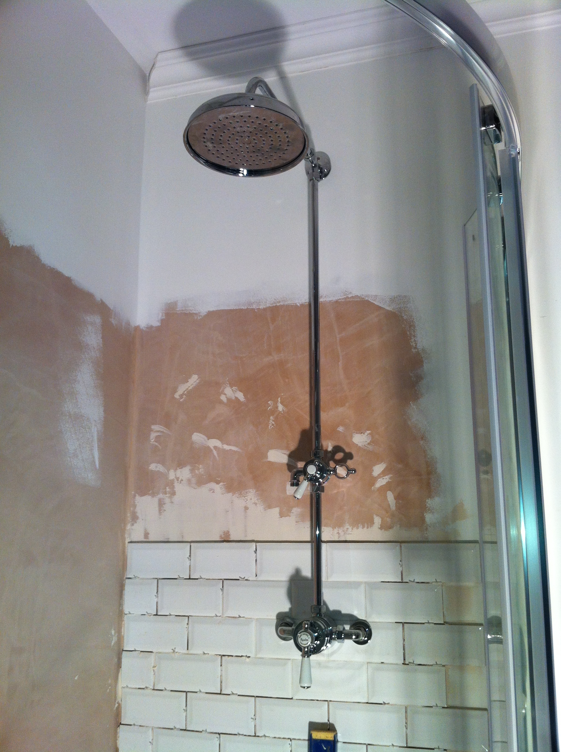
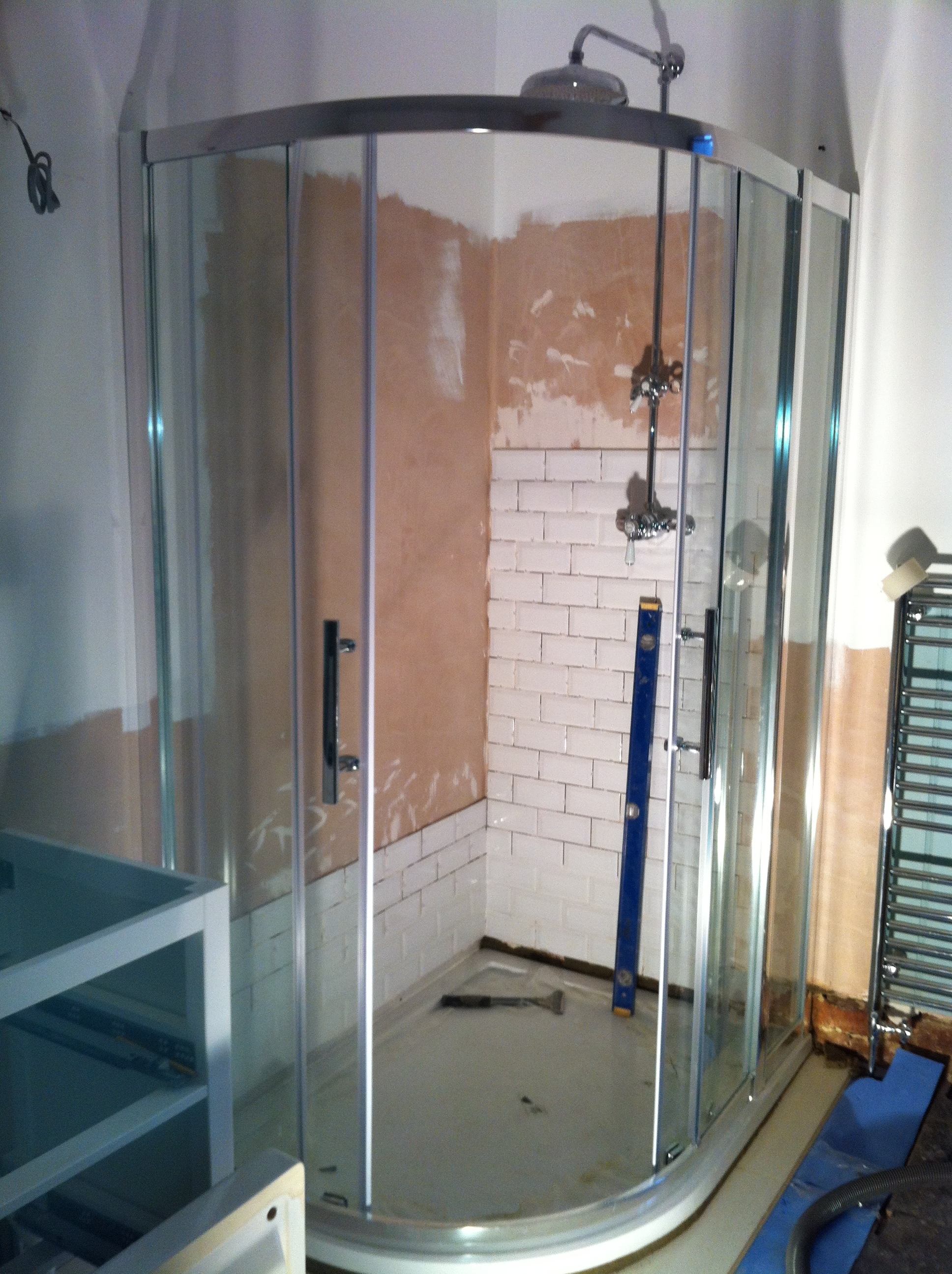
The photos below pretty much tell the full story - but there were definitely some things we learned along the way (scroll down for my top tips):
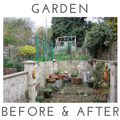
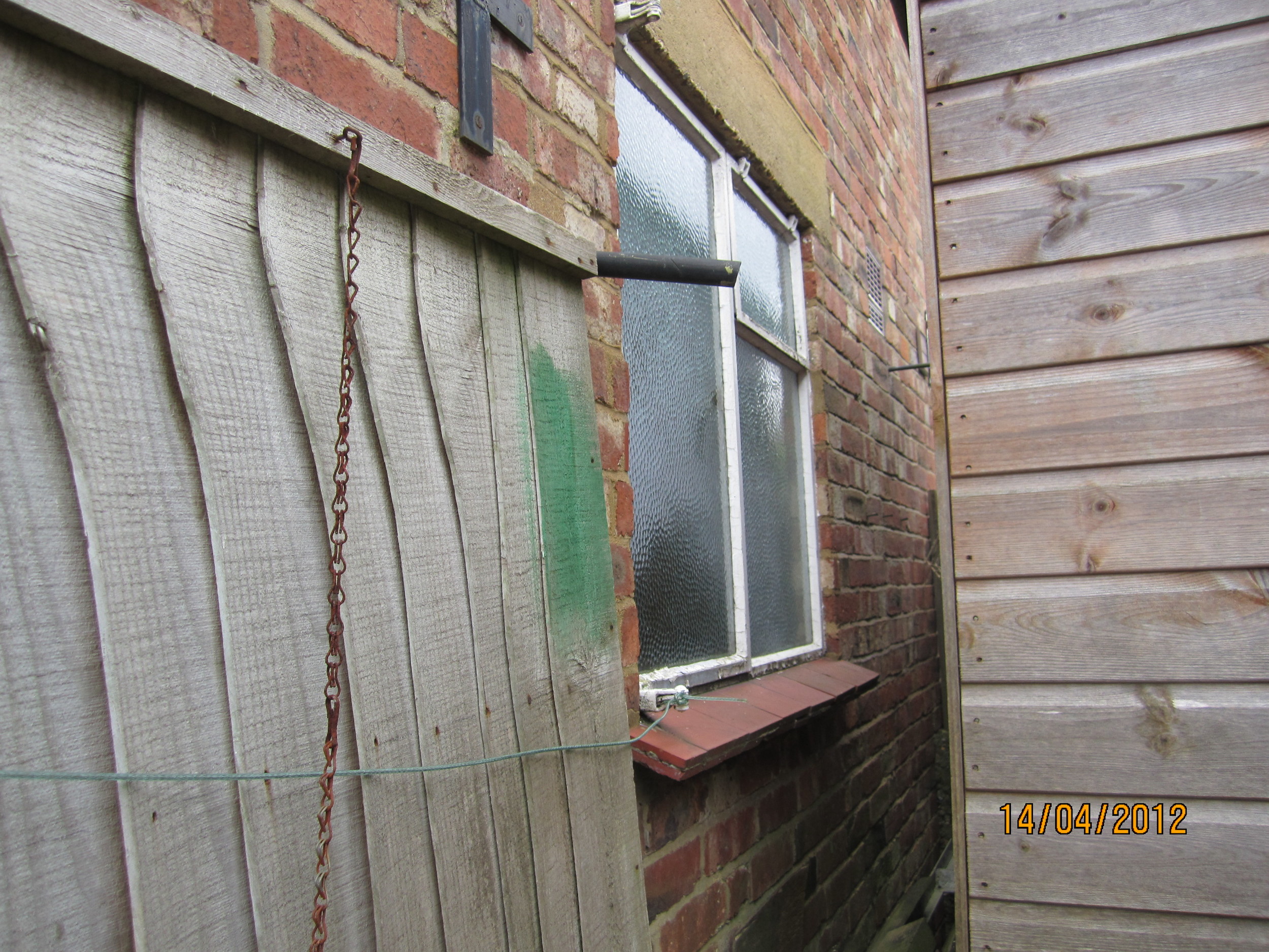
PREVIOUS BATHROOM (DOWNSTAIRS)
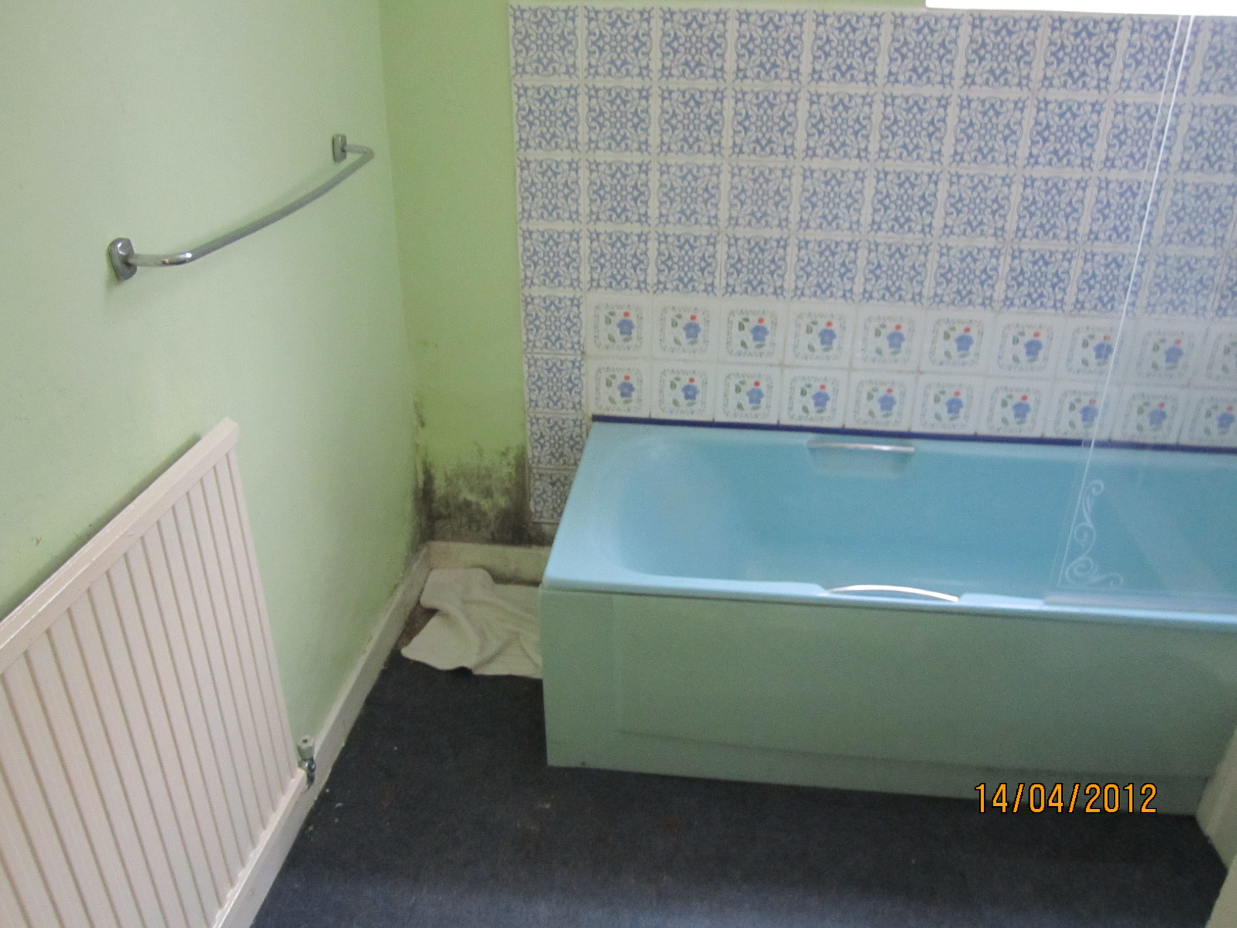
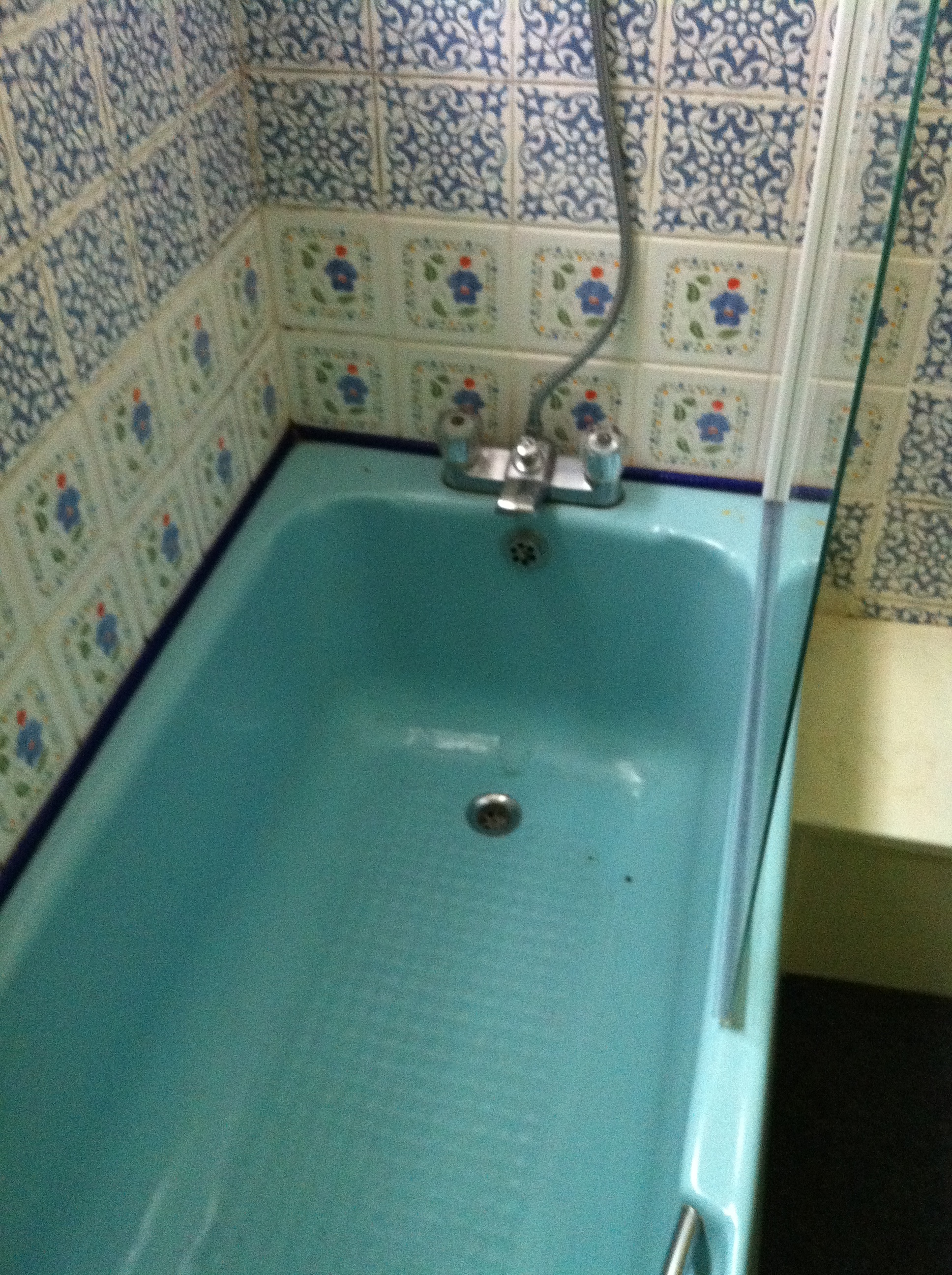
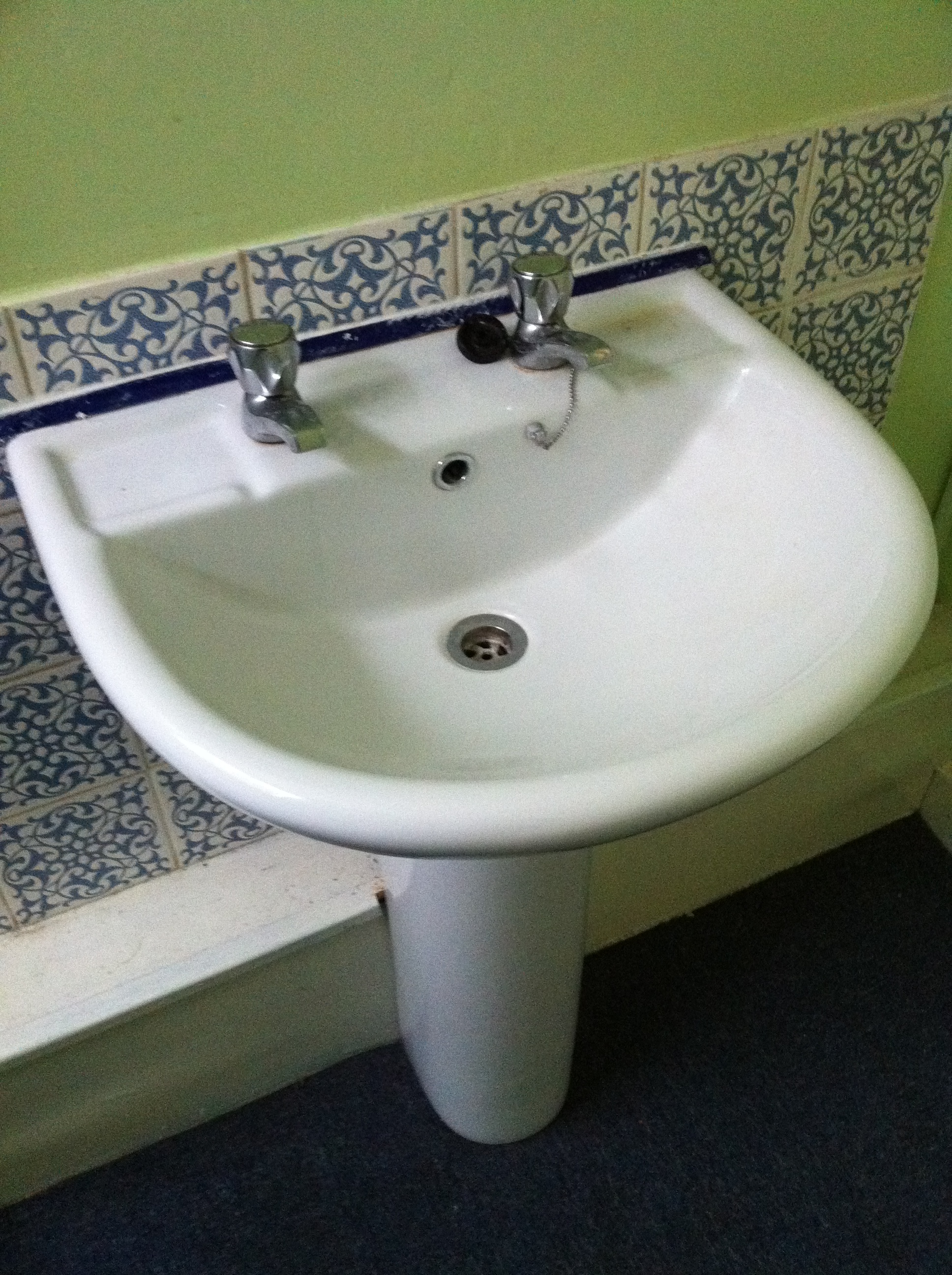
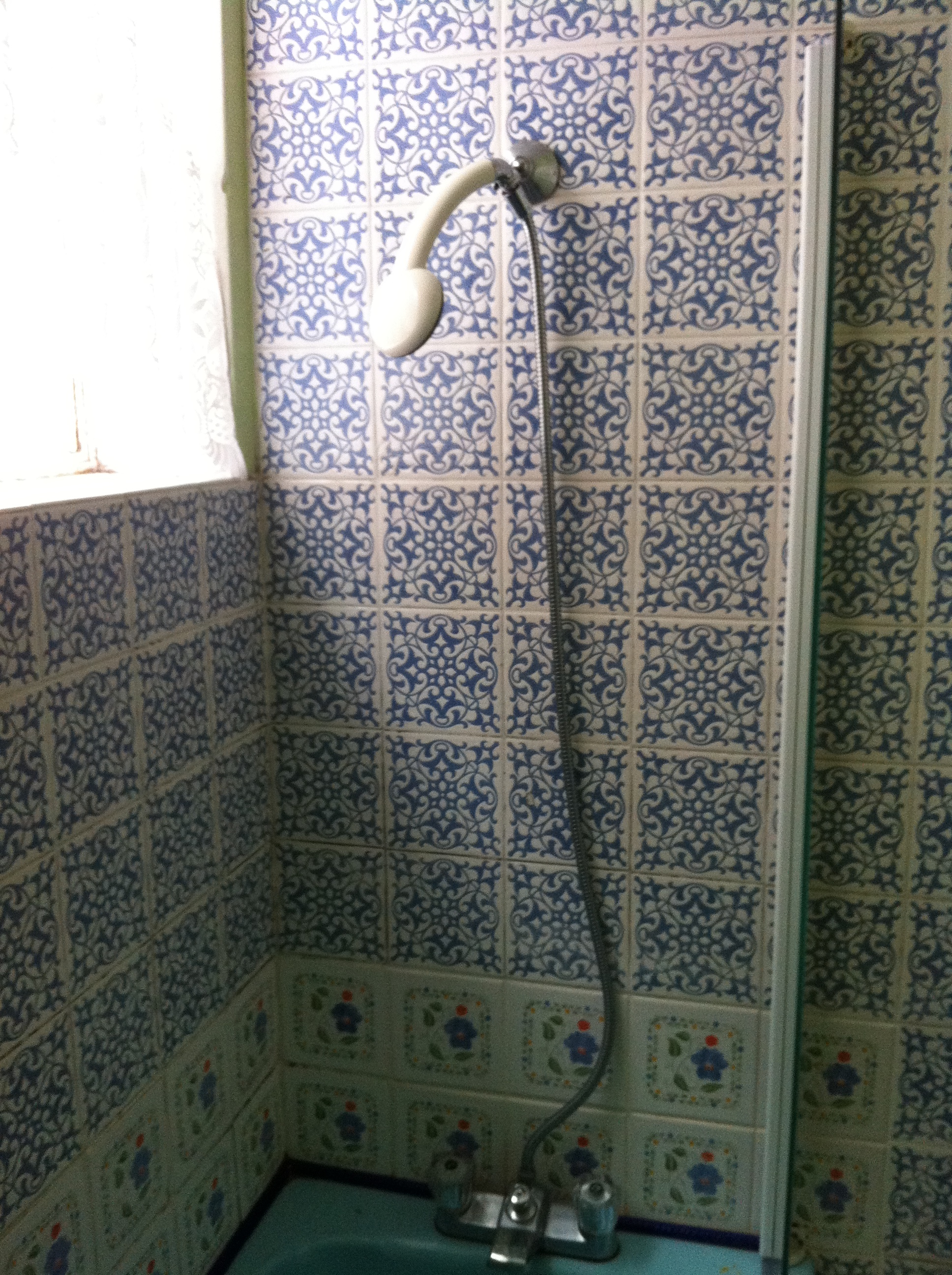
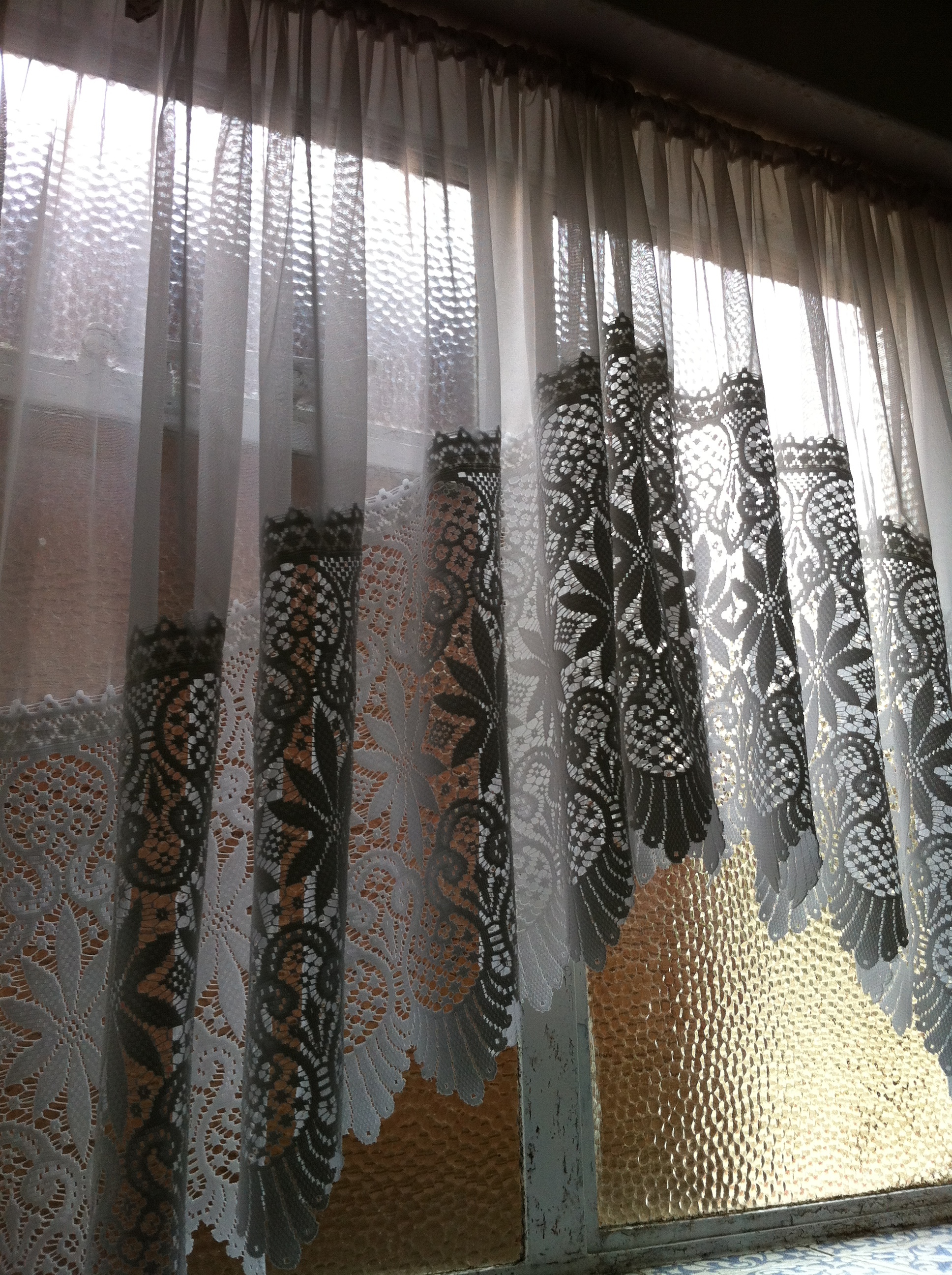
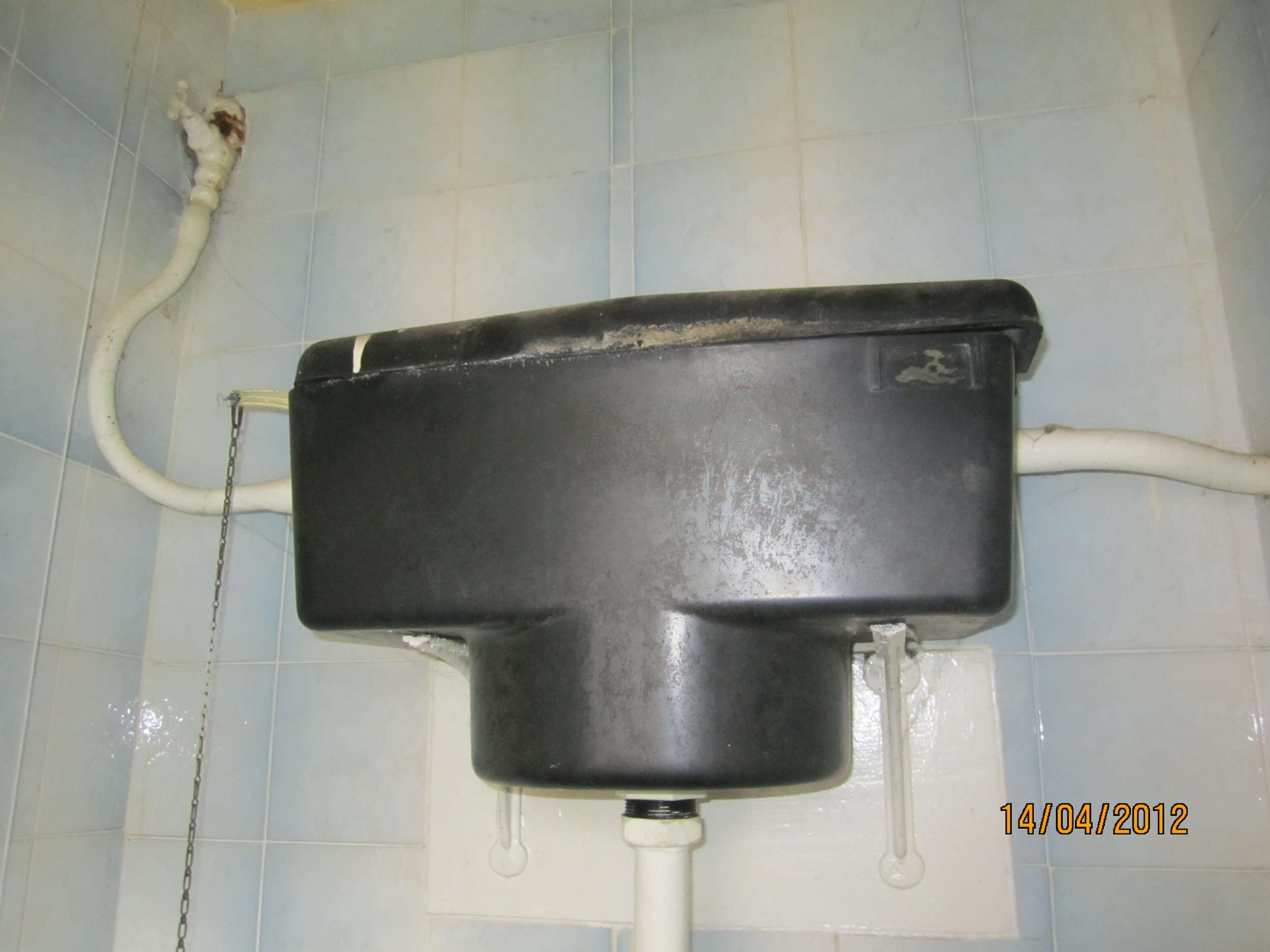
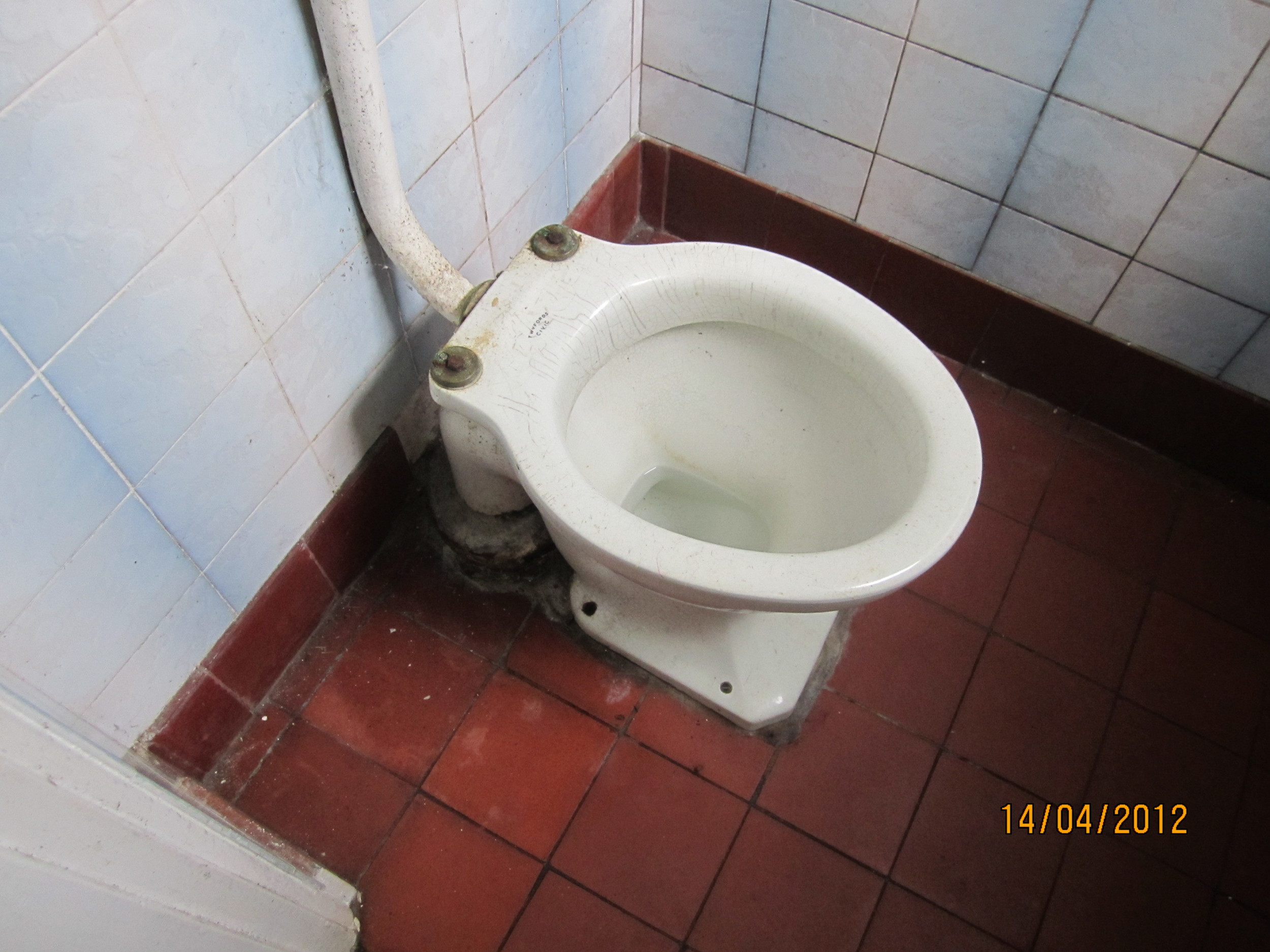
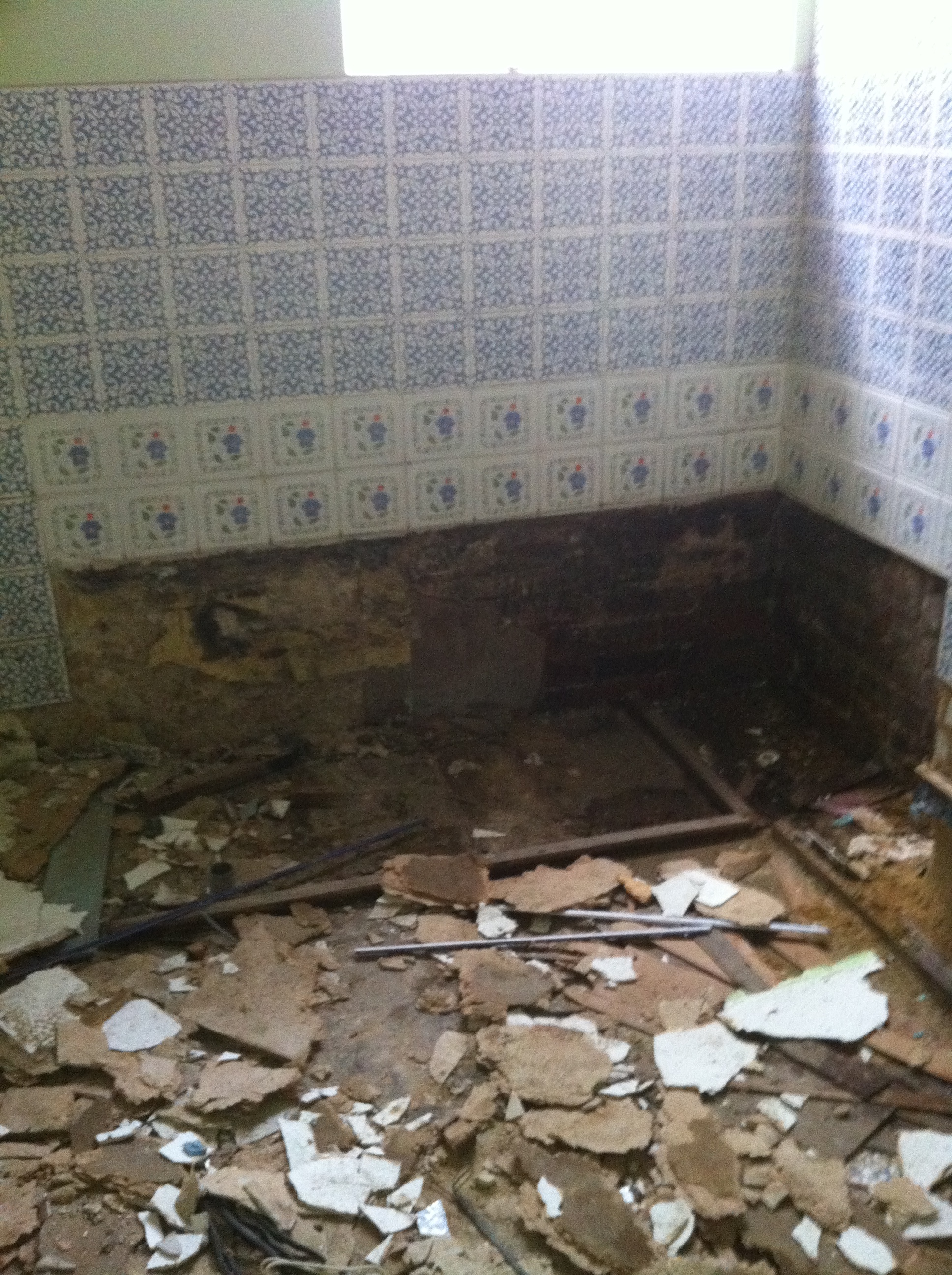
BATHROOM BEFORE
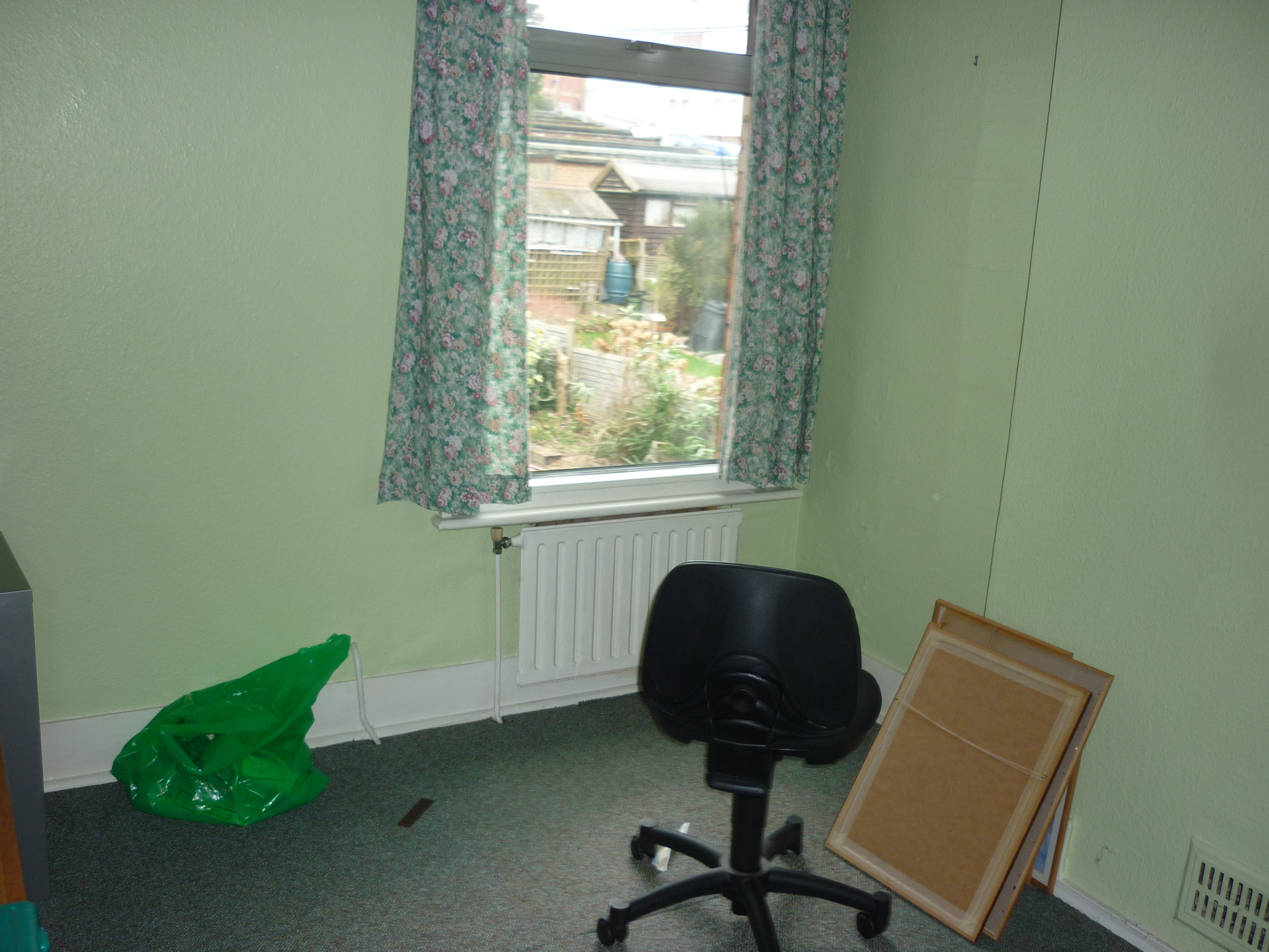
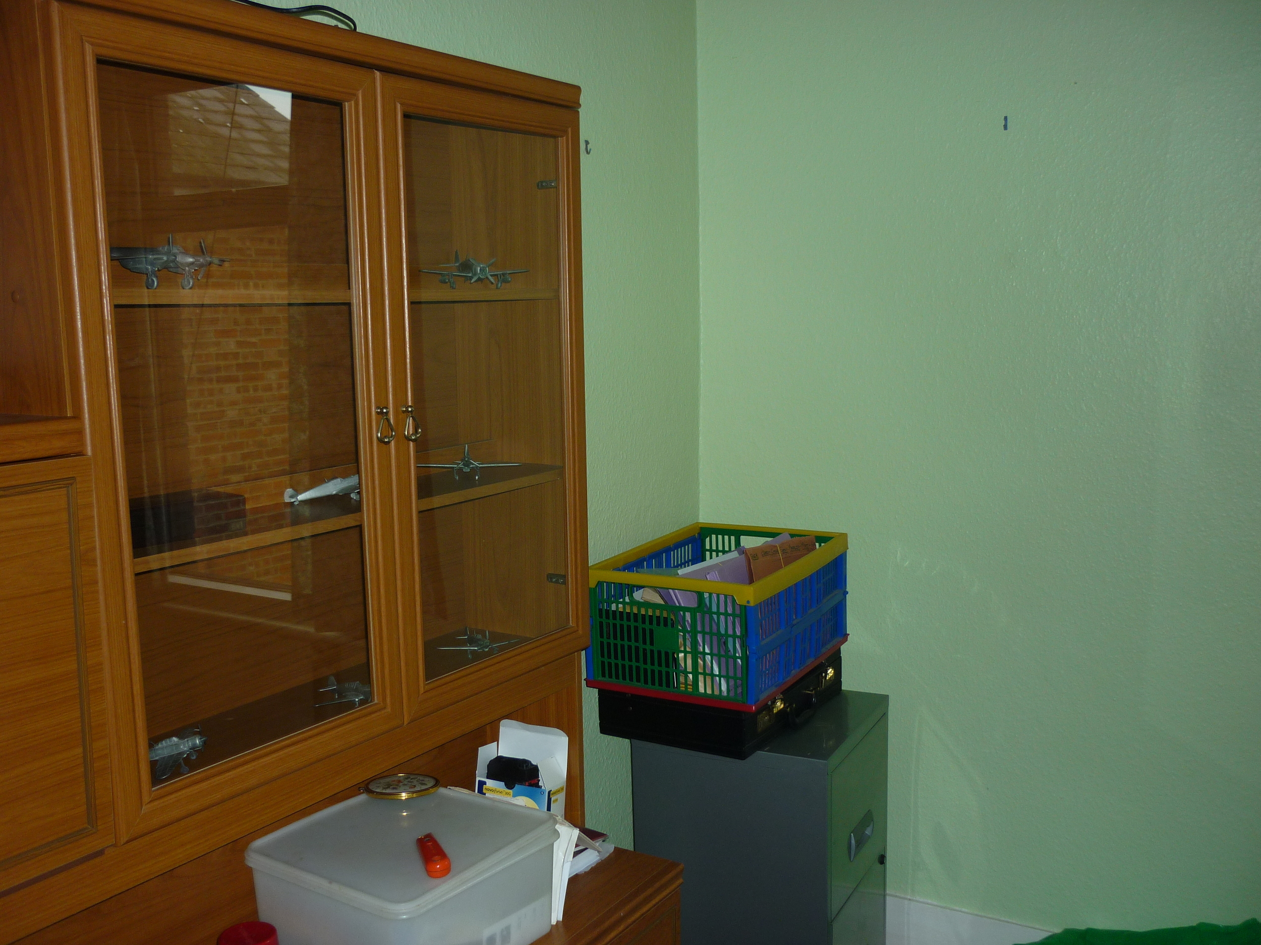
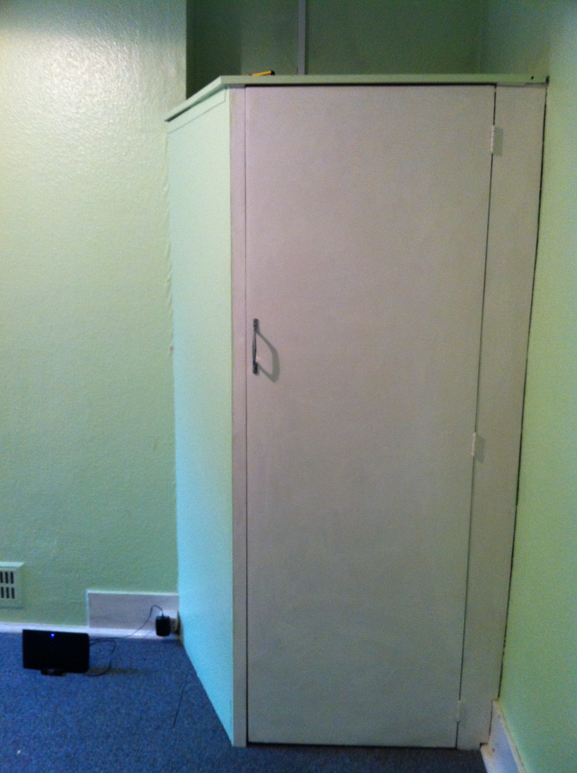
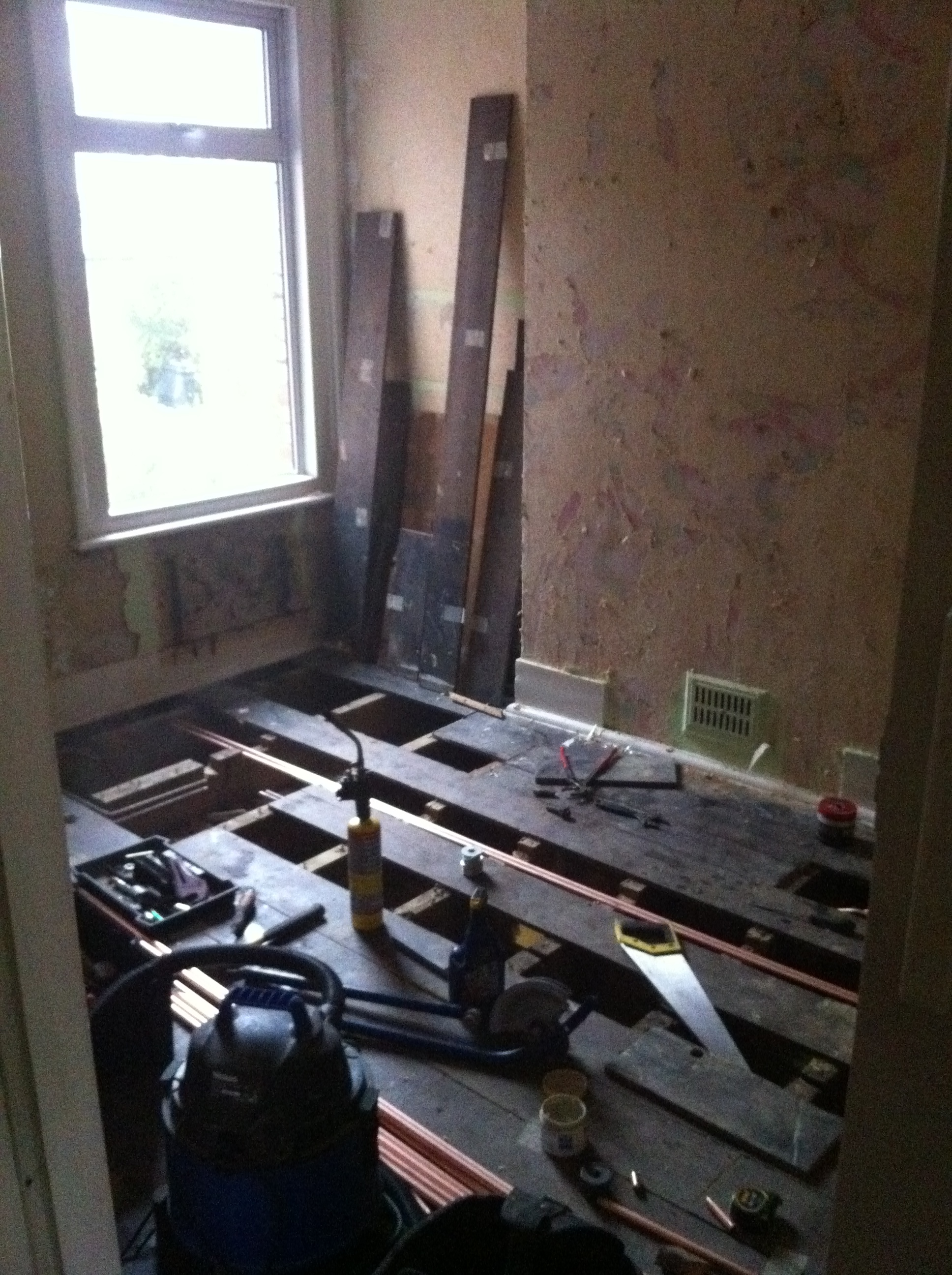
DurING




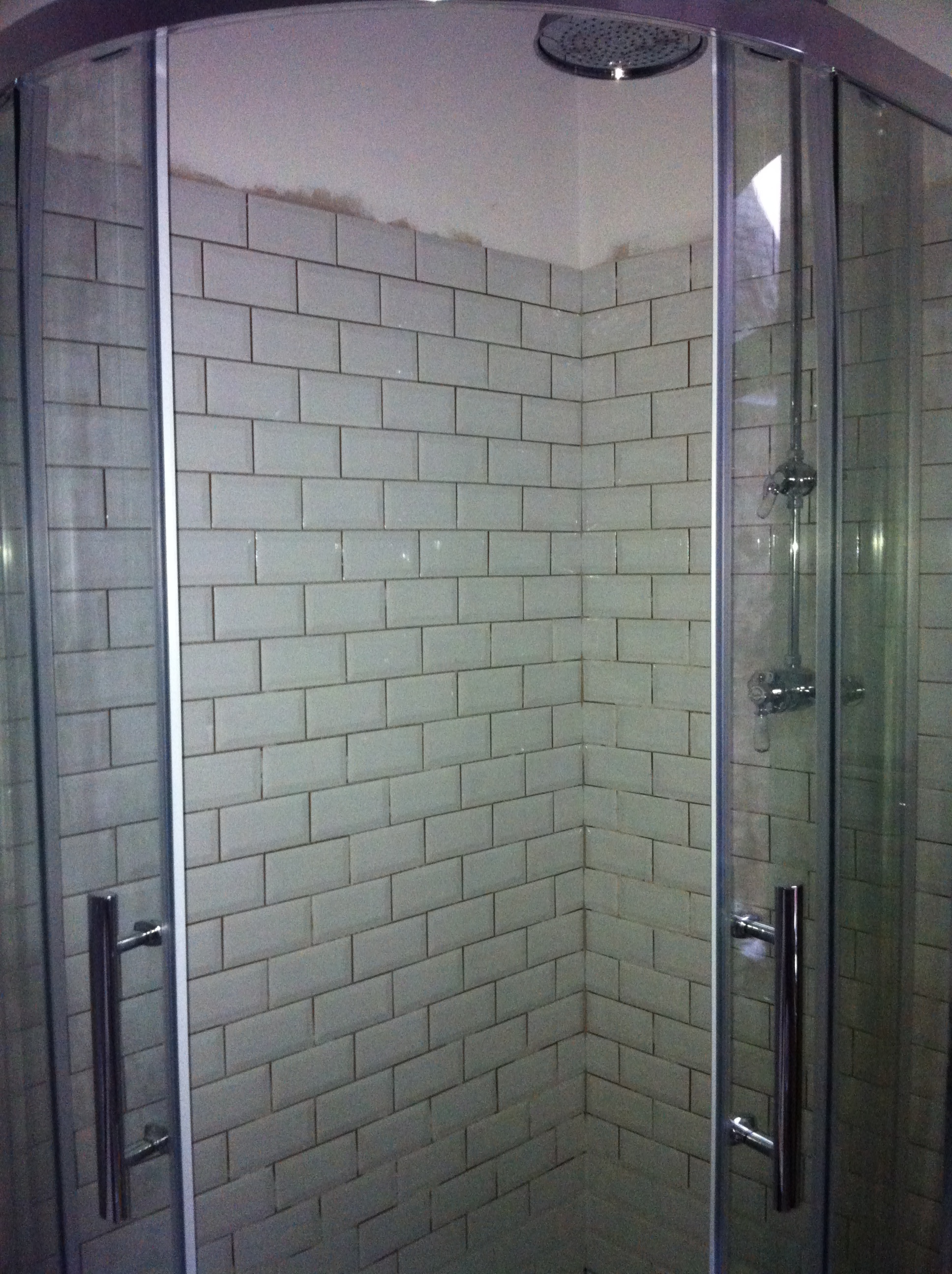


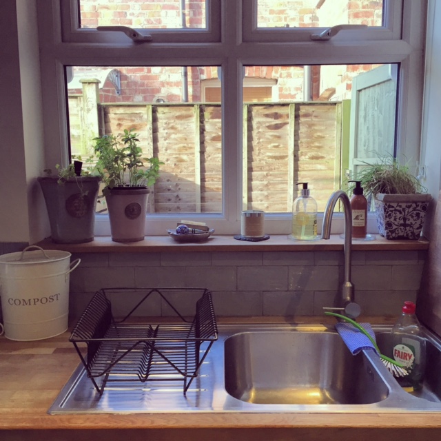
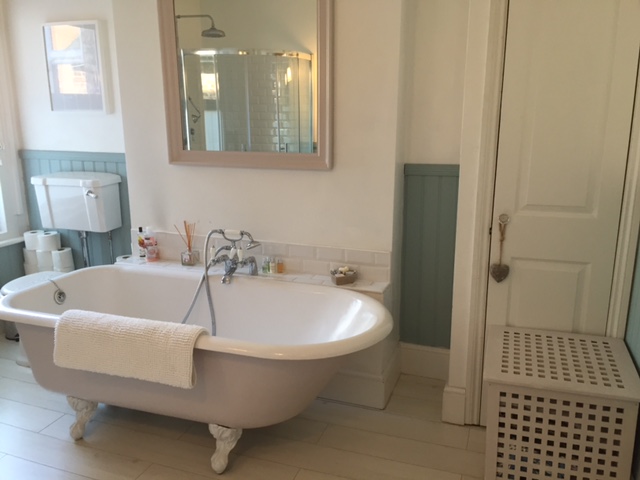
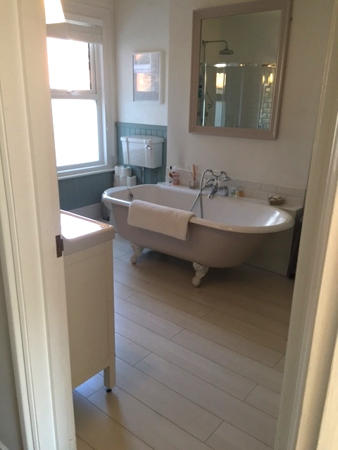
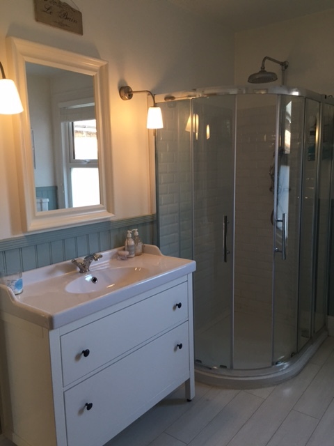
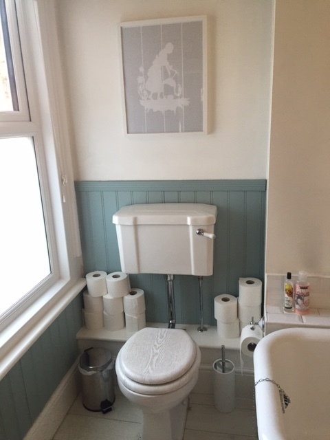
AFTER

TOP TIPS
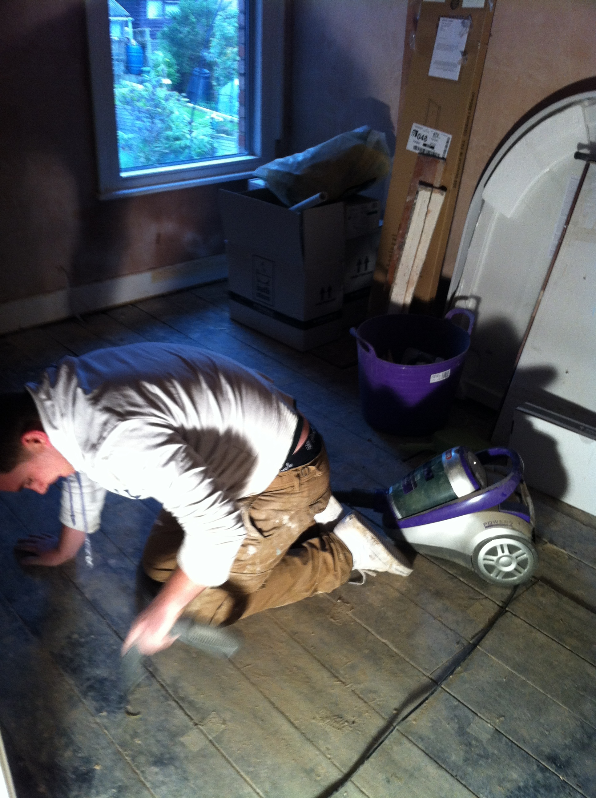
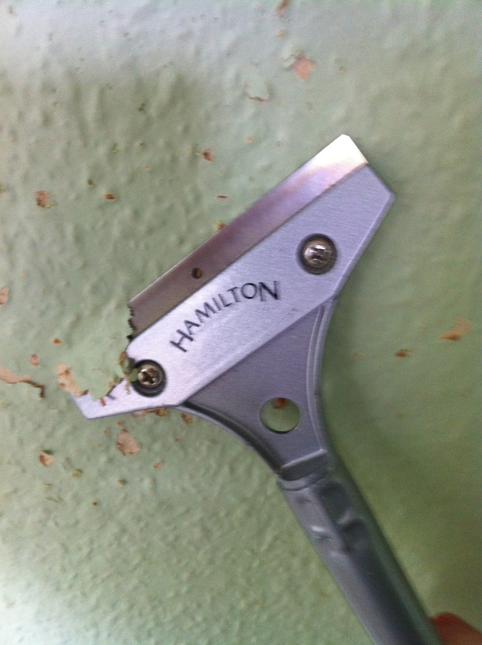
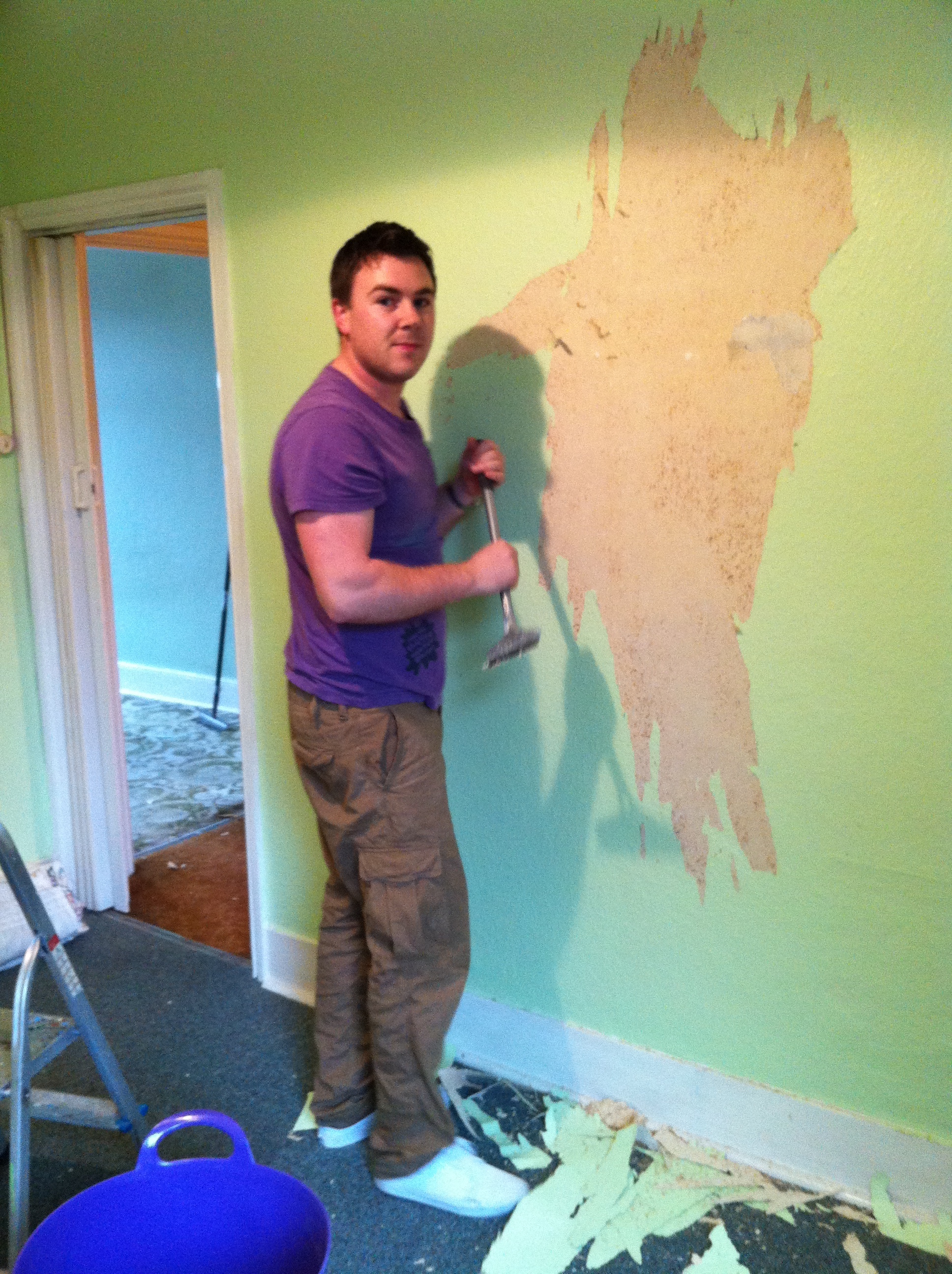
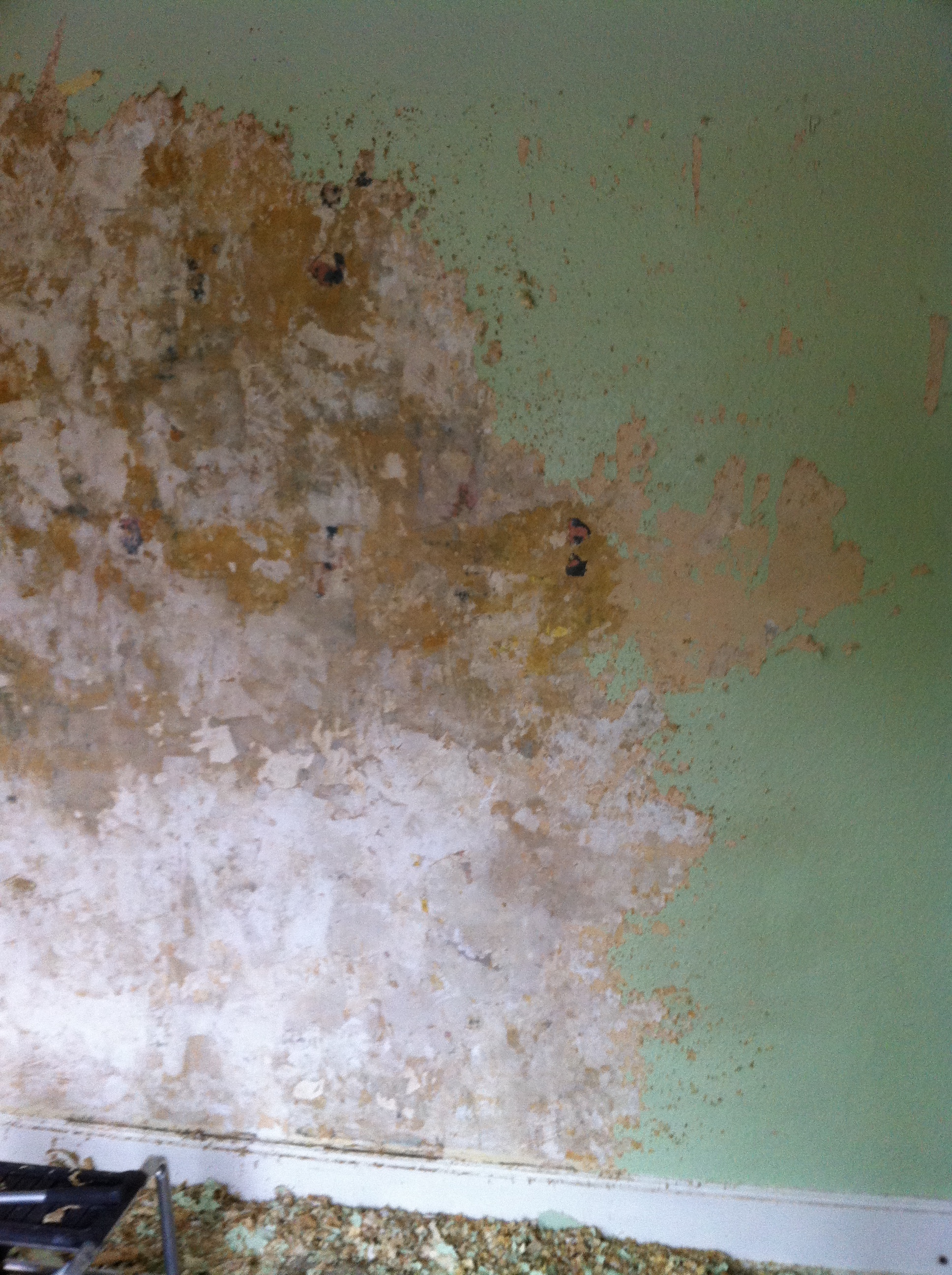
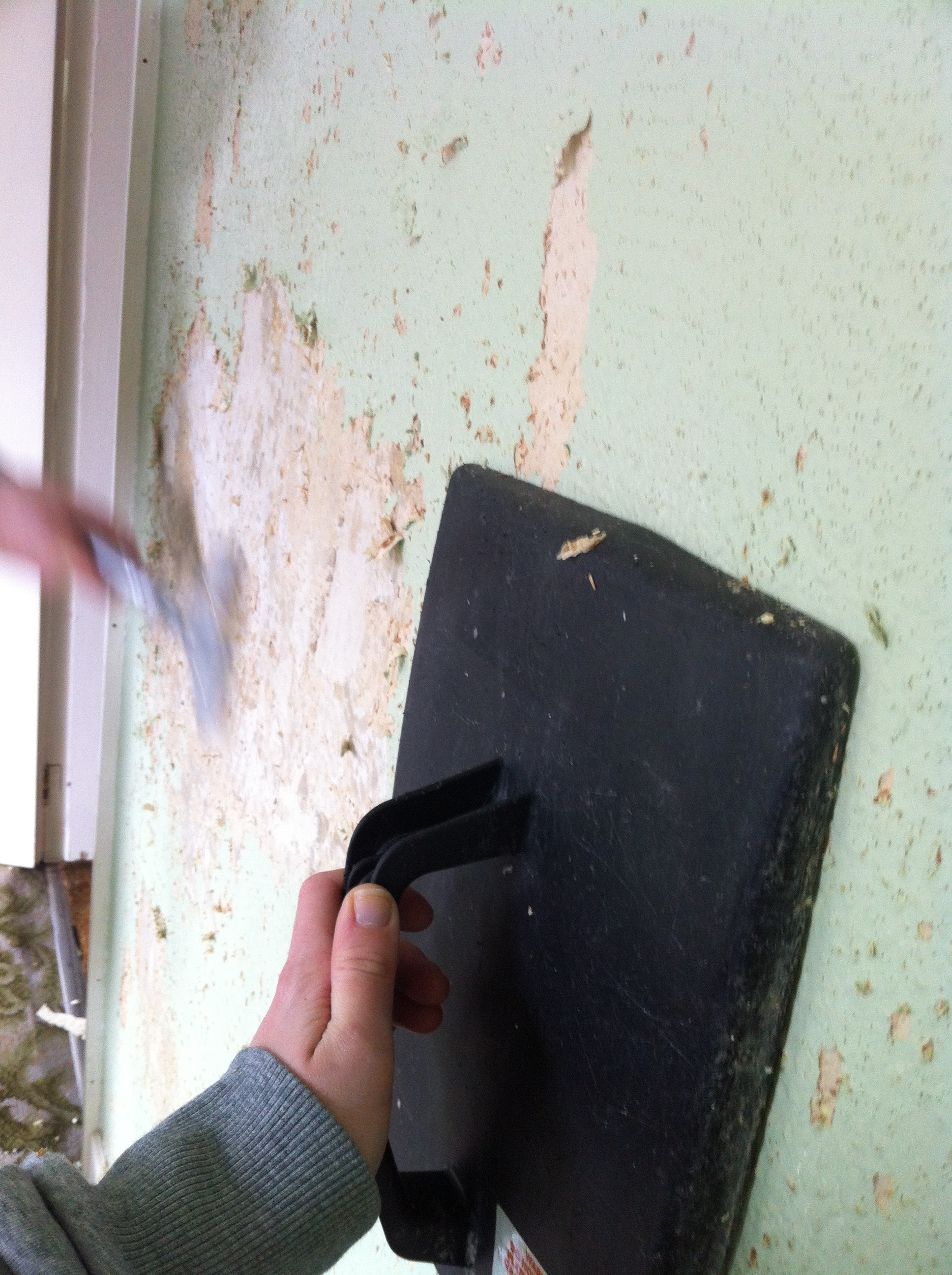
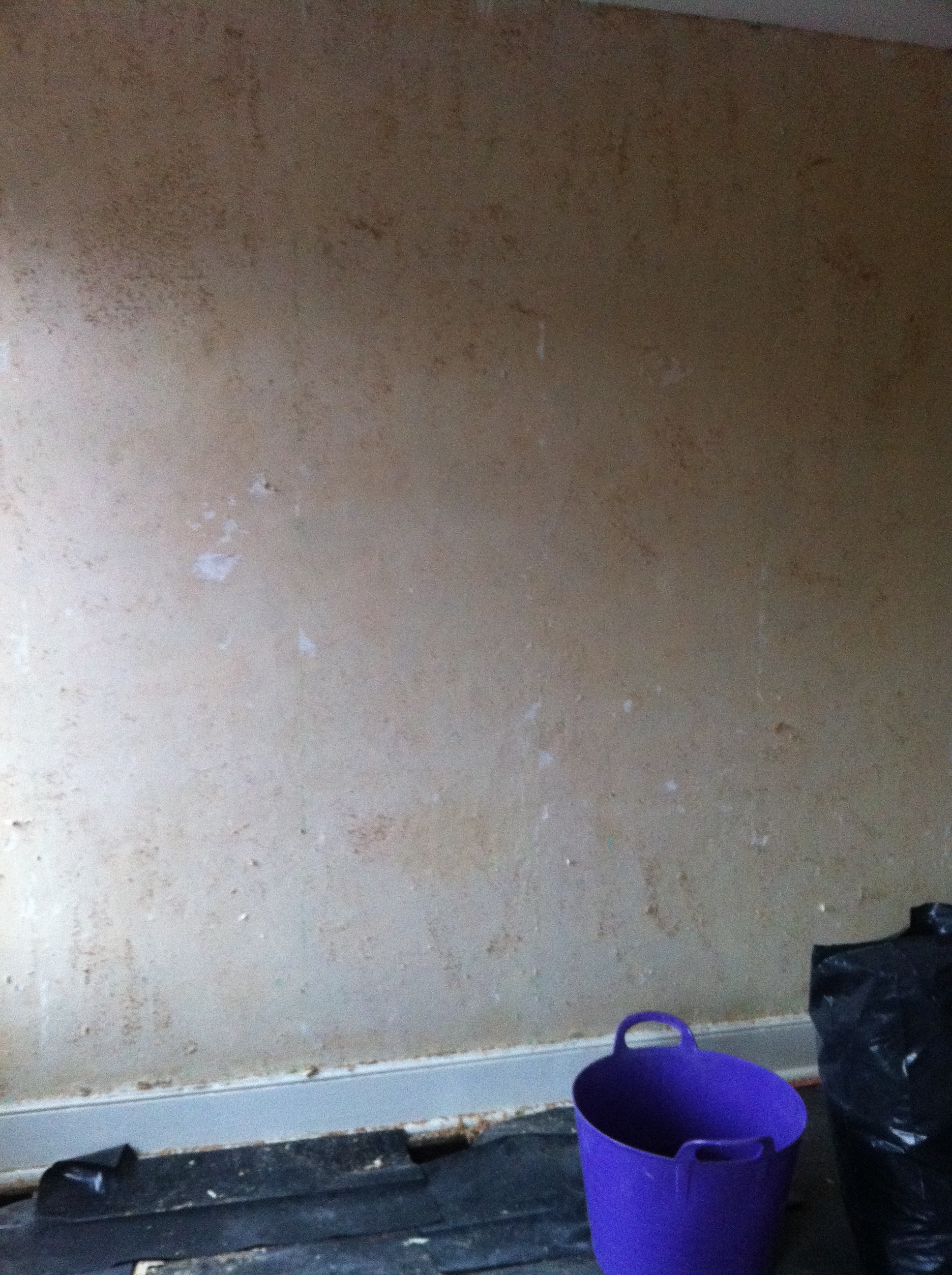
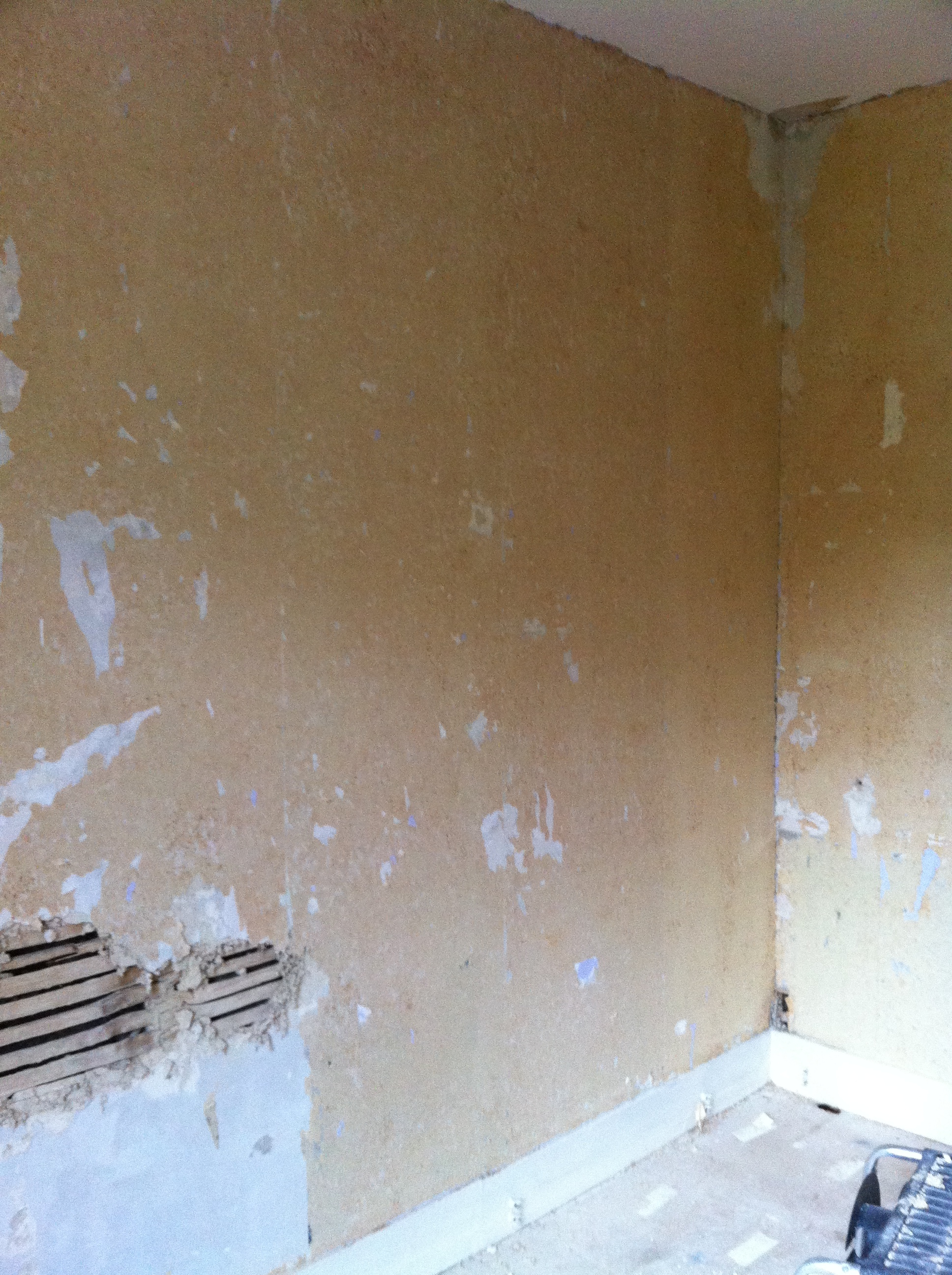
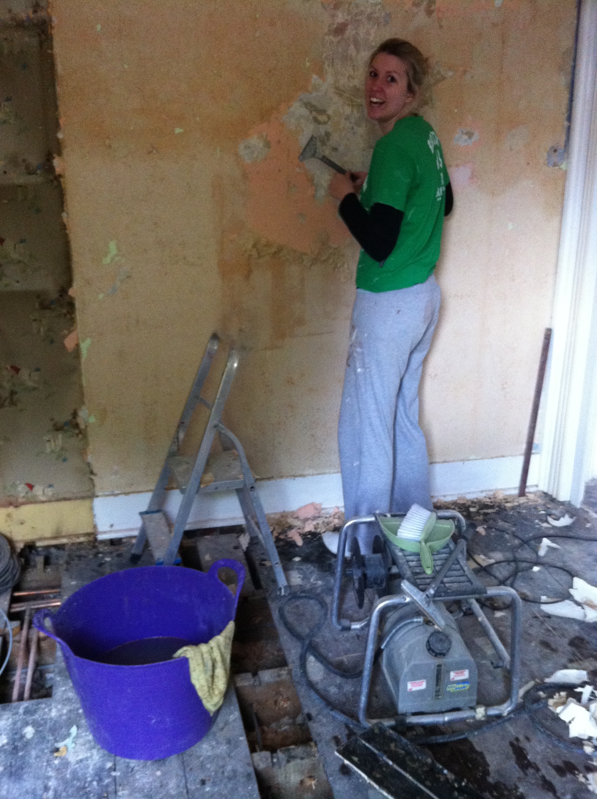
- Don't be disheartened if you spend hours removing woodchip, to then be told the whole wall needs to come down. Sadly, you can't tell the true condition of a wall until you see it properly. It took us, and our incredible friend Maria, a couple of days to strip the walls... I'll always remember Maria's face when our builder said: "Nope, sorry. It's got to come down." That was a low point.
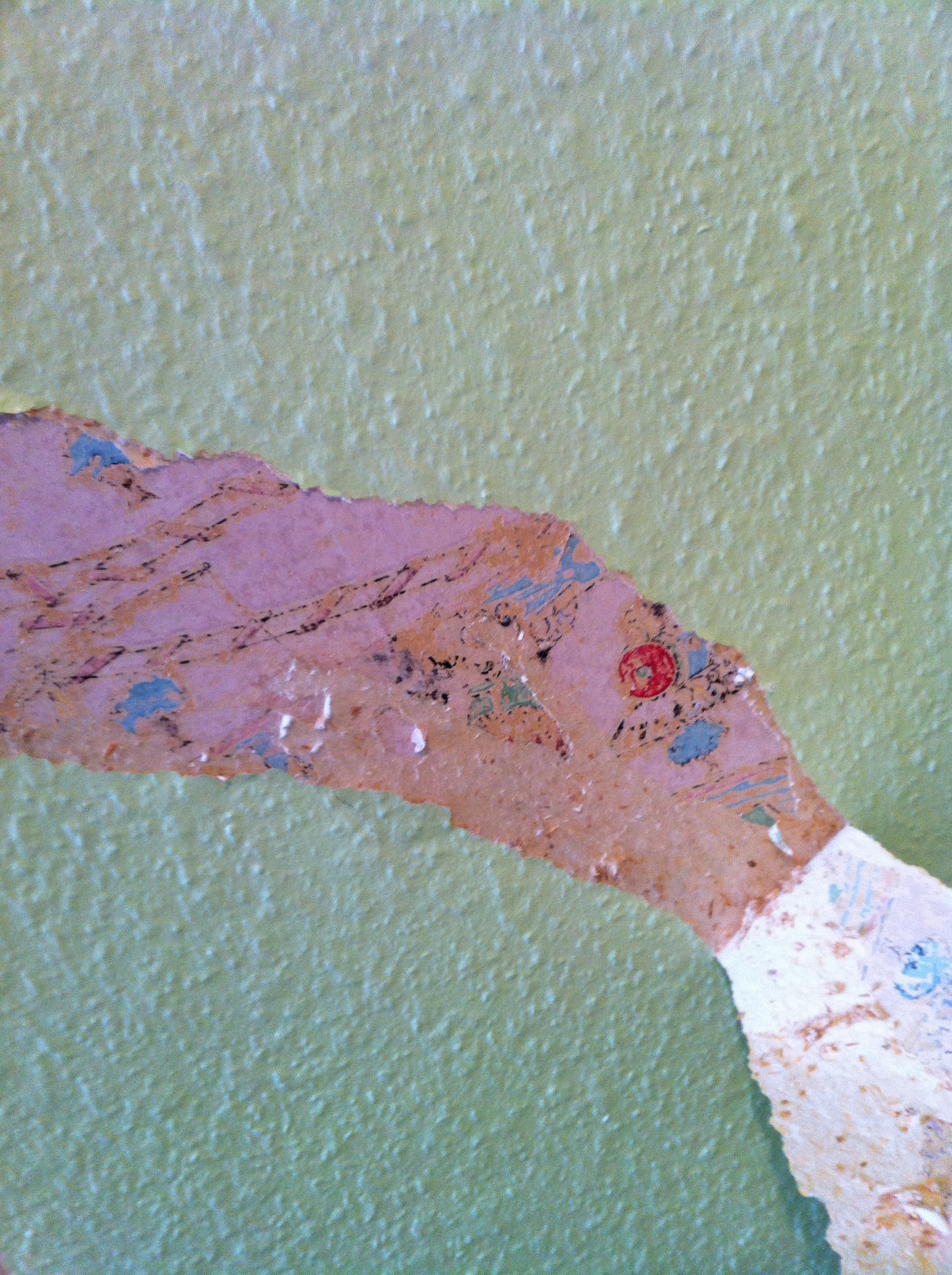
- But you do have high points: We discovered layers and layers of retro wallpaper, from 50s Disney to 70s poodles. It had obviously been a children's bedroom over the years. Renovating a house is the most tiring but brilliant experience as you get to piece together discoveries as you go - slowly learning a bit more about the people who lived there before you.
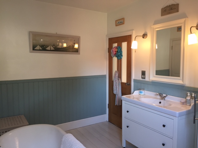
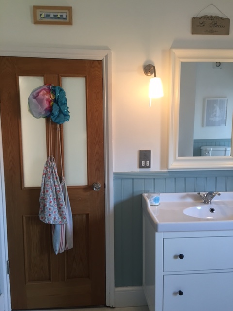
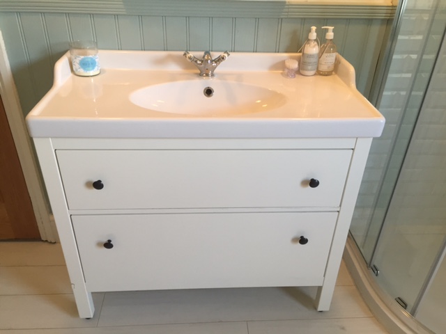
- IKEA does the best sink/cabinet combinations. This way, you get loads of storage but don't have to add bulky wall cabinets that can make a room feel smaller, or shelves that collect dust. Instead, add a big mirror to reflect the light, as well as wall lamps either side in case you want some cosy lighting while relaxing in the bath.
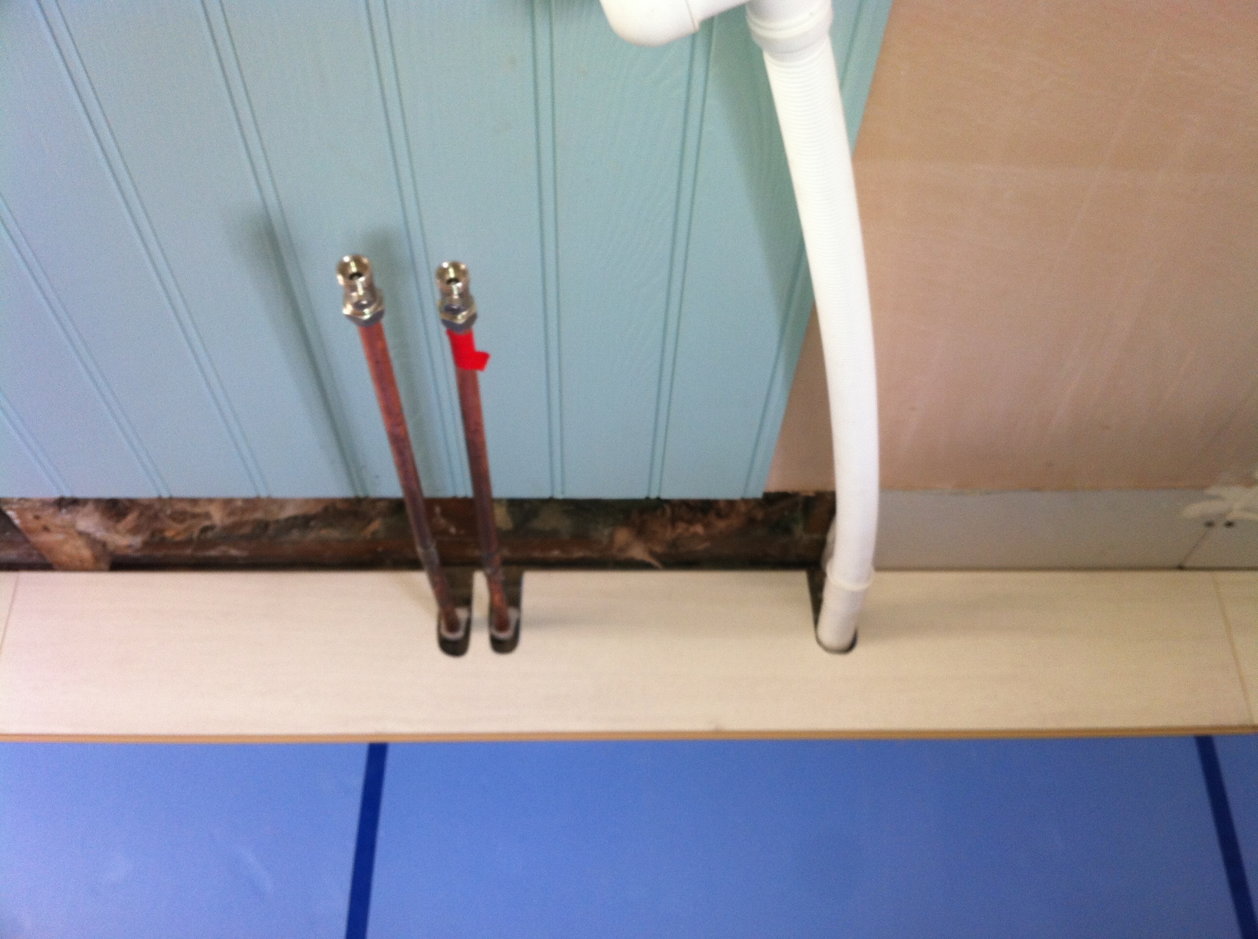
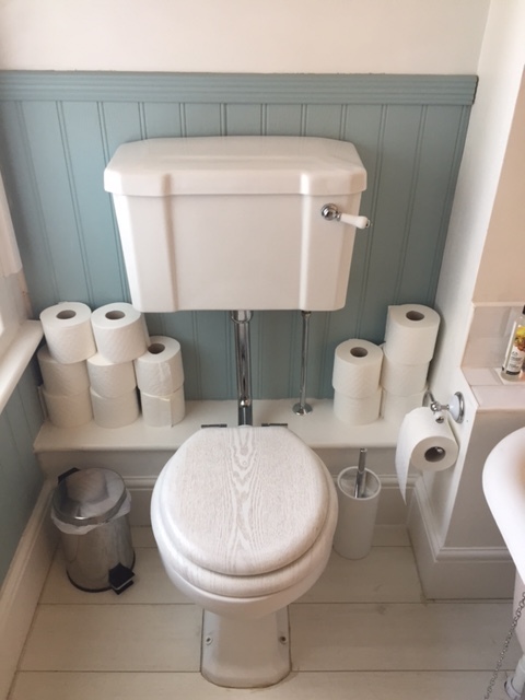
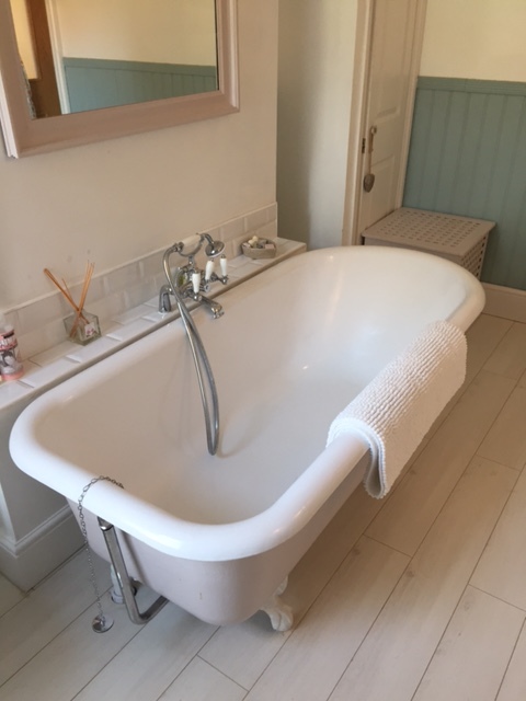
- We struggled deciding on the floor - I loved the look of floorboards but wasn't convinced they would be practical, especially with water. L sourced the most amazing (and affordable) compromise - waterproof laminate flooring in wood effect ("beach house"). It sounds a bit naff, but it really isn't. We loved the final result.
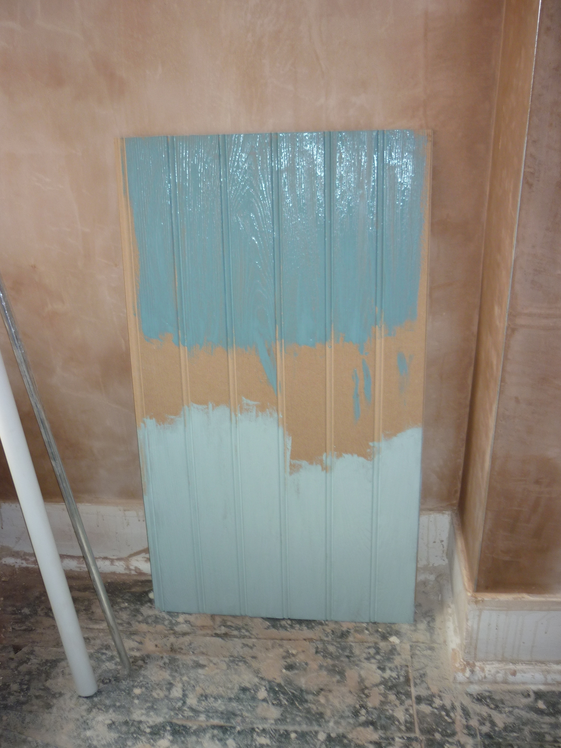
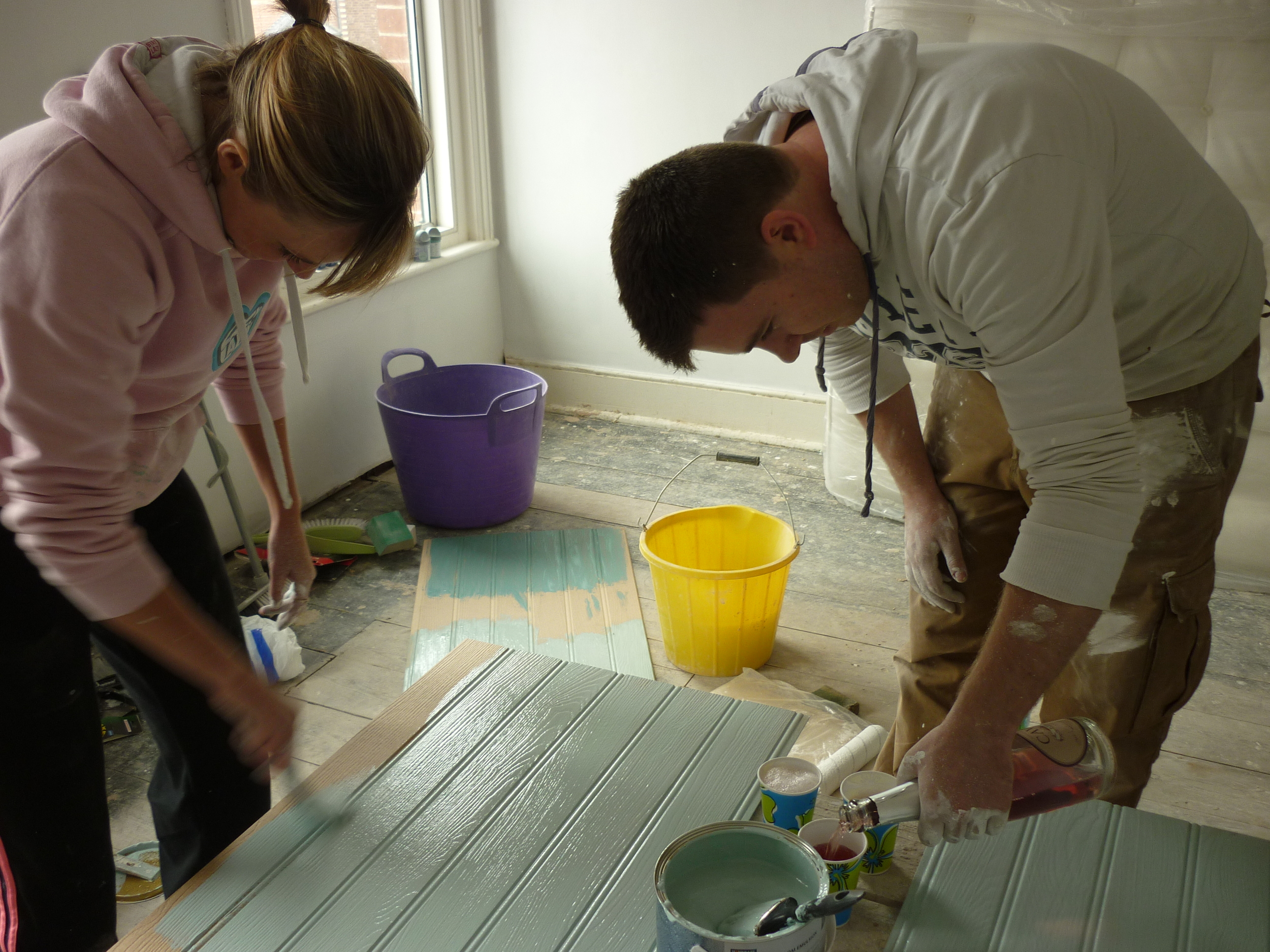
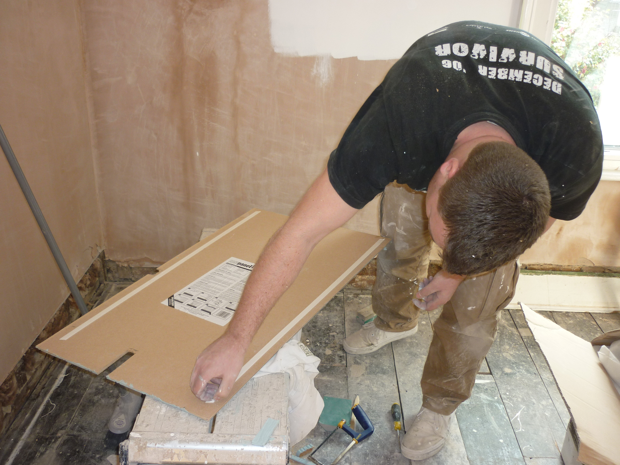
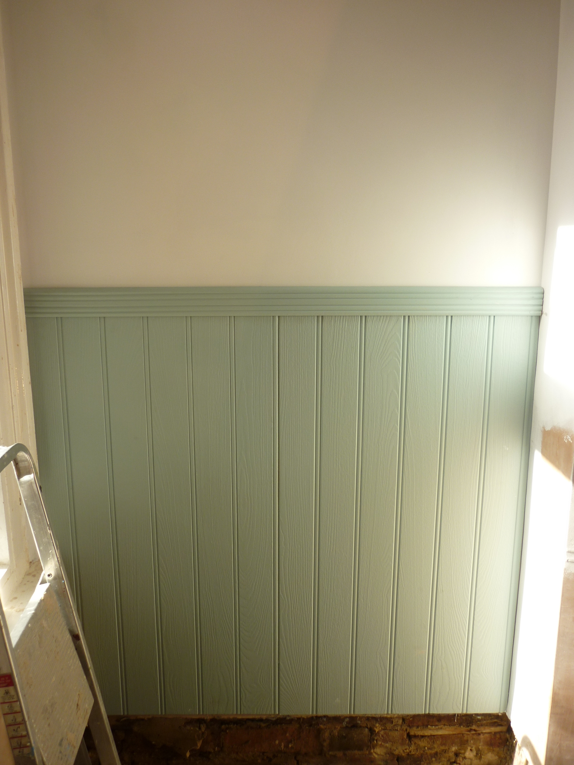
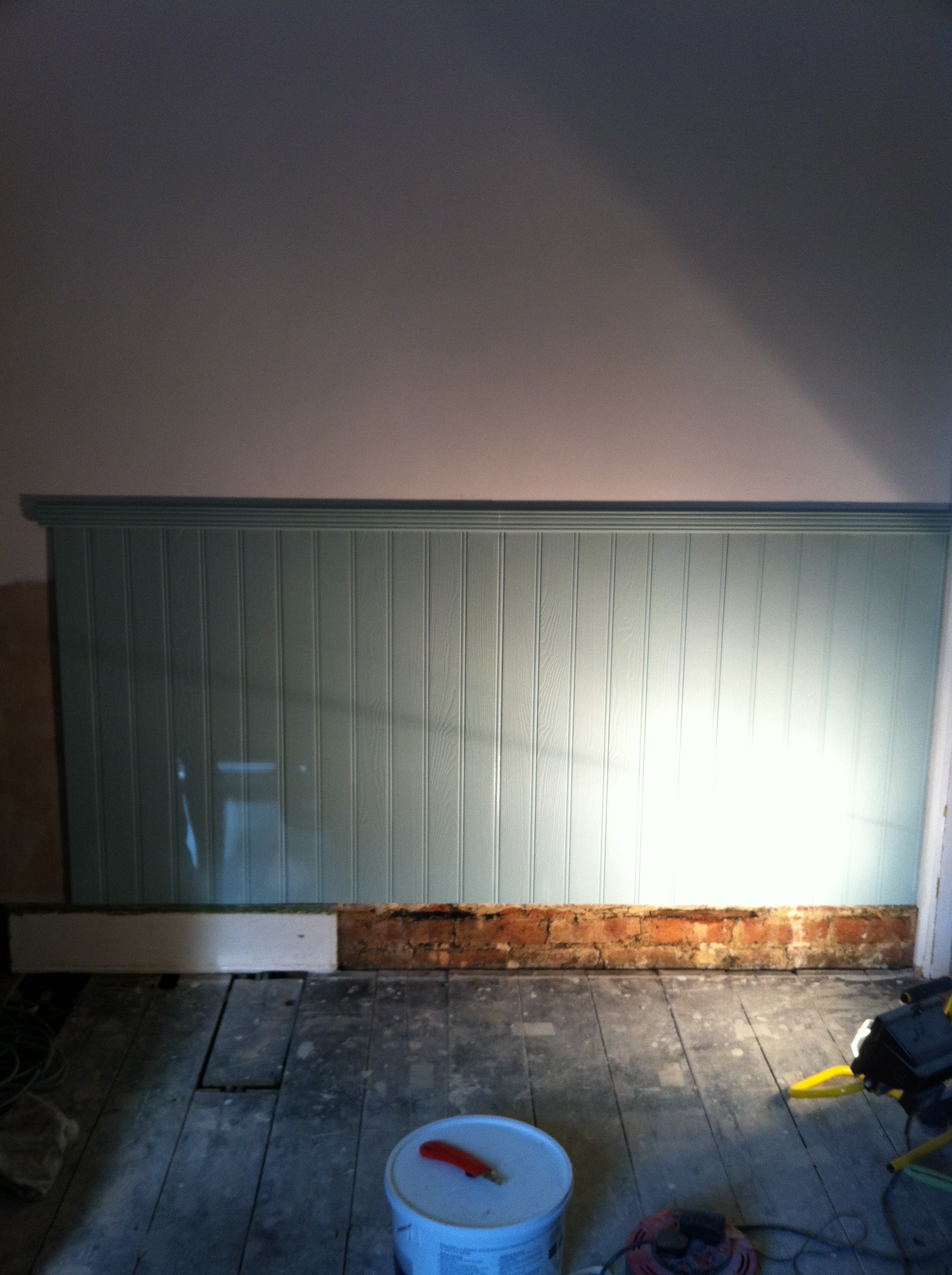
- Tongue and groove is a great option for breaking up plain walls - if we hadn't used it, I think the room would have felt quite sparse and cold (as I didn't want to tile everywhere), plus it protects the walls from daily wear and tear. We opted for Homebase kitchen/bathroom paint in Duck Egg to add some colour.
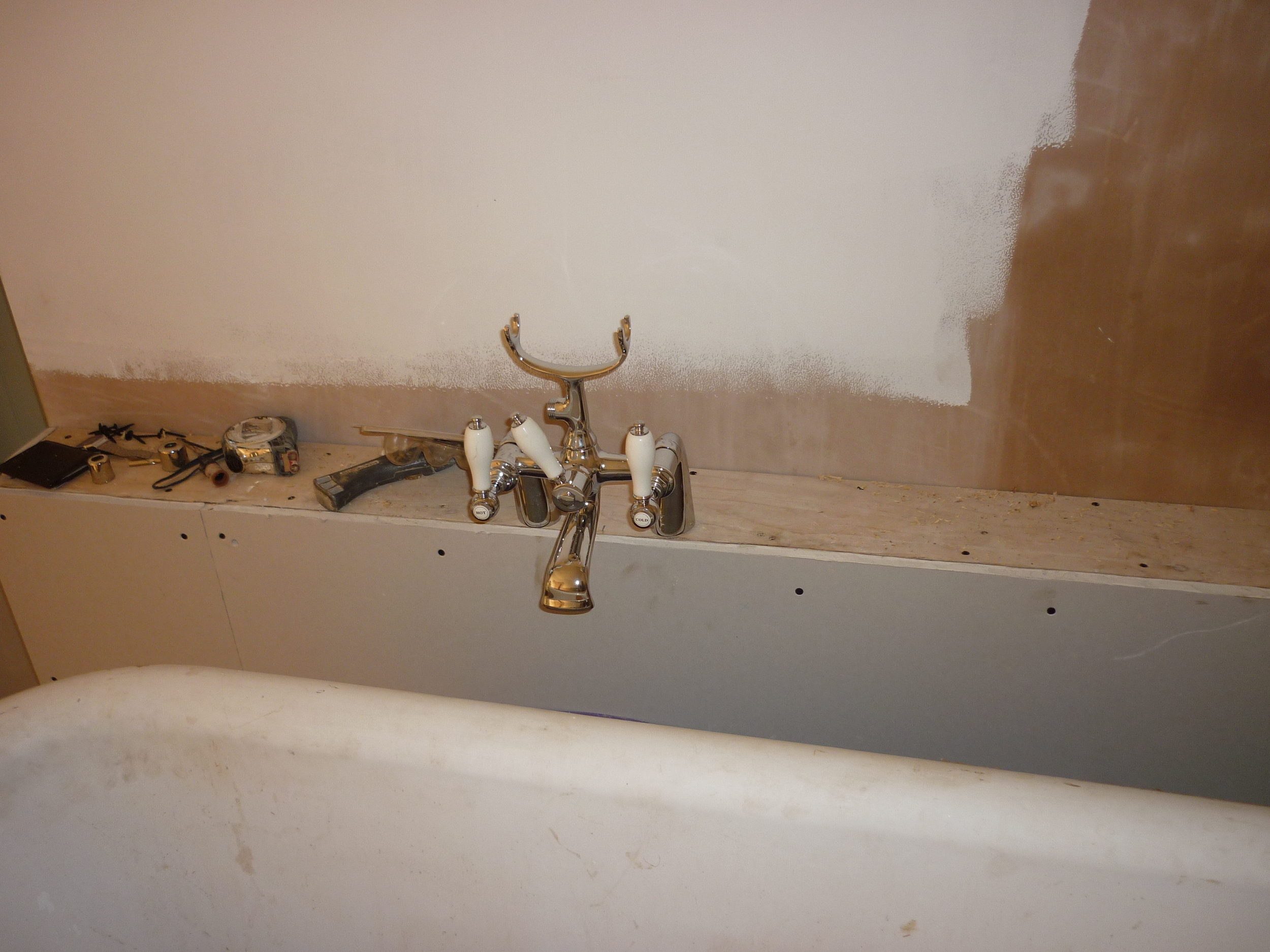
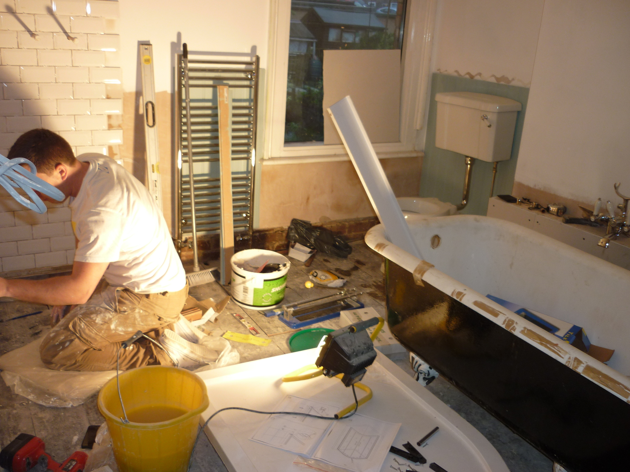
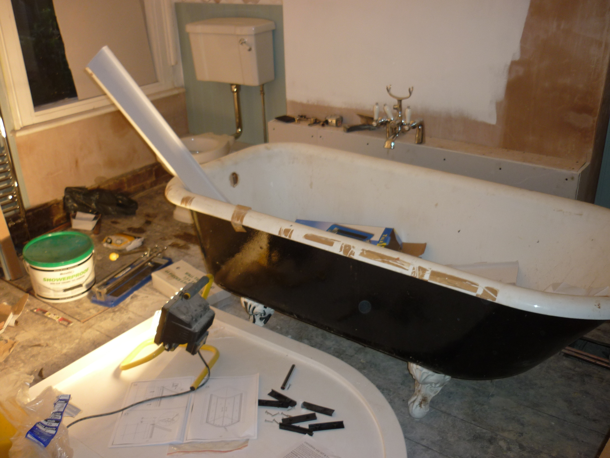
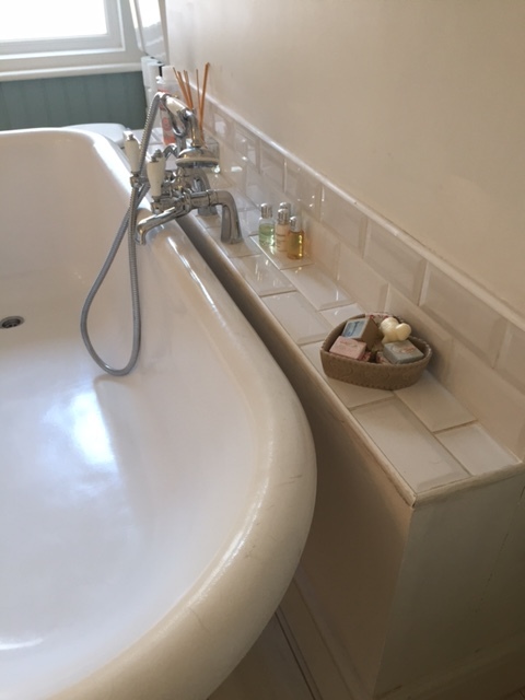
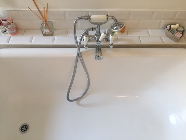
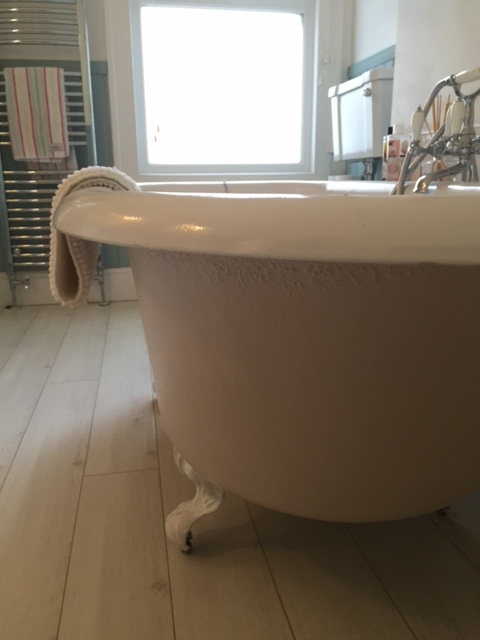
- Our cast iron roll top bath cost us £38 from Gumtree. It had seen better days! So we bought a self-enamel kit online and gave it a facelift with a dusty pink Dulux paint (for metal). We then bought the fittings online to keep costs down.
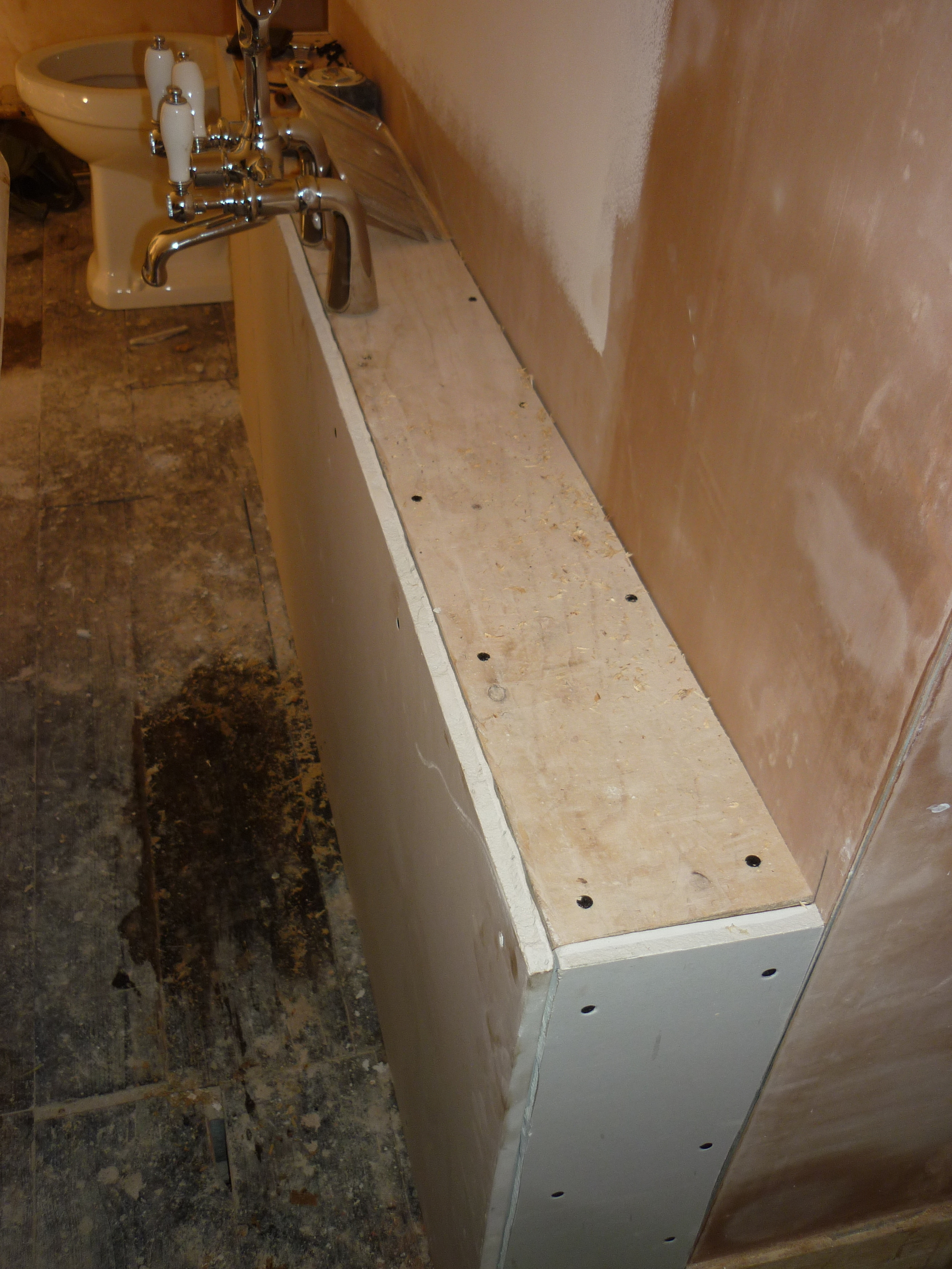
- We decided to build a shelf next to the bath, fitted onto the wall. This provided storage for the taps/pipes and meant we have somewhere to put our bubble bath, shampoo etc when having a bath.
- Don't scrimp on towel rail radiator size in a medium-large bathroom. We initially put a smaller one in but one winter and we quickly changed it for a bigger one! (The smaller one was used in the new bathroom we put in during our loft conversation the following year.)
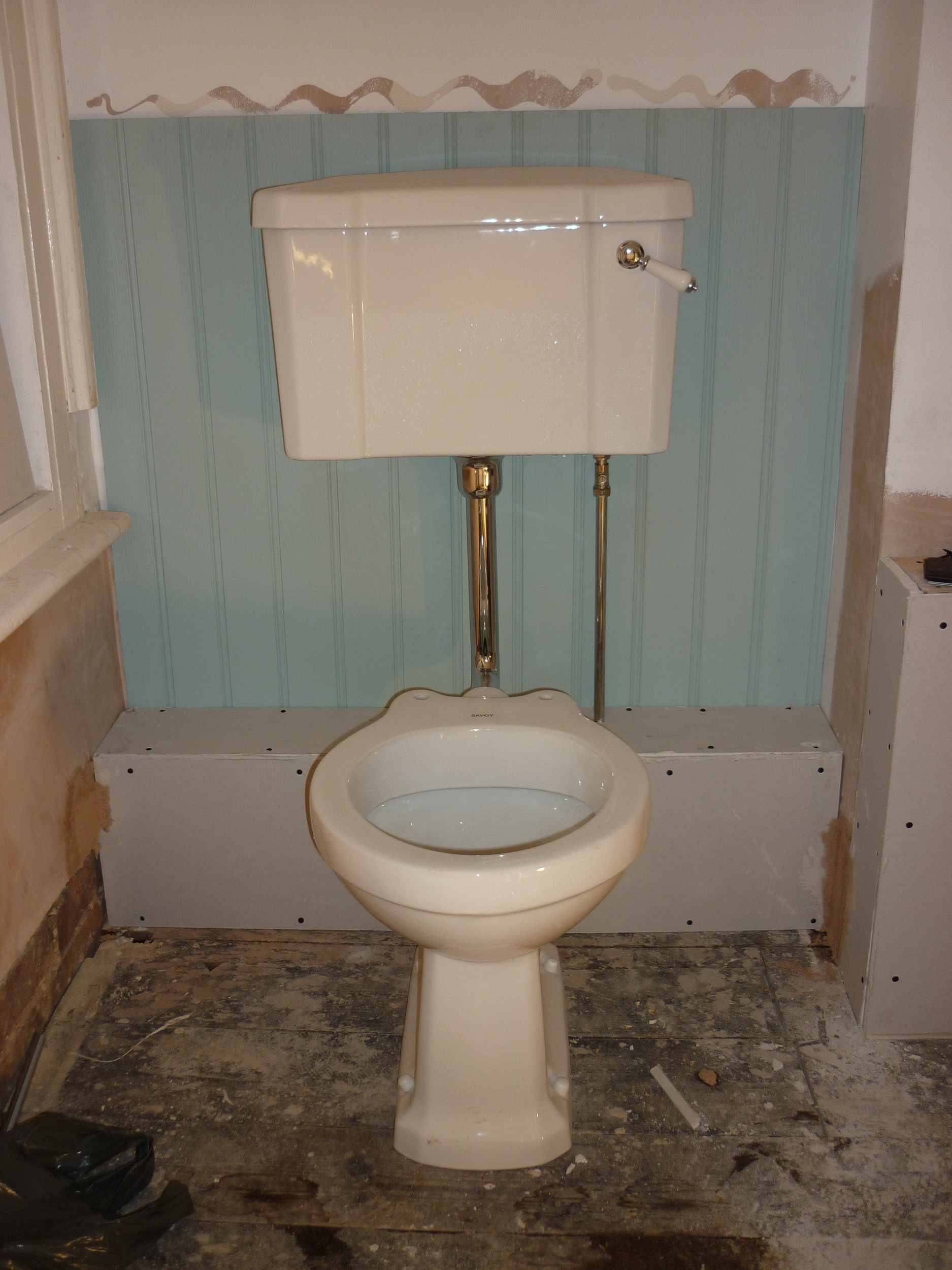
- While we opted for a traditional Victorian toilet to fit with the rest of the house, it does collect dust - so we opted for a built-in cistern in our single loo and loft bathroom. Less to clean and it provides a shelf for toilet roll, diffusers, even books!
- We store our towels on one of these behind a spare bedroom door rather than in the bathroom as they become a bit dry with all the hot steam circulating when you have a shower.
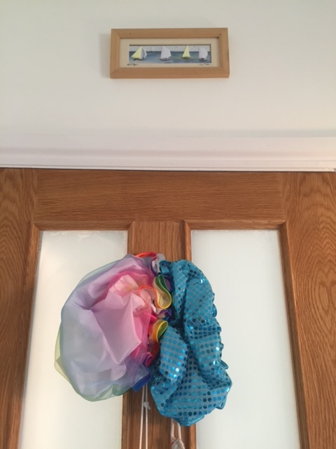
- For better light, opt for a door with windows in the top two panels, then add sticky back plastic to them for privacy.
Take a look at my Bathroom Pinterest Board for more decor ideas.


